Chapter 1 Regression and the Normal Distribution
Chapter Preview. Regression analysis is a statistical method that is widely used in many fields of study, with actuarial science being no exception. This chapter provides an introduction to the role of the normal distribution in regression, the use of logarithmic transformations in specifying regression relationships and the sampling basis that is critical for inferring regression results to broad populations of interest.
1.1 What is Regression Analysis?
Statistics is about data. As a discipline, it is about the collection, summarization and analysis of data to make statements about the real world. When analysts collect data, they are really collecting information that is quantified, that is, transformed to a numerical scale. There are easy, well-understood rules for reducing the data, using either numerical or graphical summary measures. These summary measures can then be linked to a theoretical representation, or model, of the data. With a model that is calibrated by data, statements about the world can be made.
Statistical methods have had a major impact on several fields of study.
- In the area of data collection, the careful design of sample surveys is crucial to market research groups and to the auditing procedures of accounting firms.
- Experimental design is a second subdiscipline devoted to data collection. The focus of experimental design is on constructing methods of data collection that will extract information in the most efficient way possible. This is especially important in fields such as agriculture and engineering where each observation is expensive, possibly costing millions of dollars.
- Other applied statistical methods focus on managing and predicting data. Process control deals with monitoring a process over time and deciding when intervention is most fruitful. Process control helps manage the quality of goods produced by manufacturers.
- Forecasting is about extrapolating a process into the future, whether it be sales of a product or movements of an interest rate.
Regression analysis is a statistical method used to analyze data. As we will see, the distinguishing feature of this method is the ability to make statements about variables after having controlled for values of known explanatory variables. Important as other methods are, it is regression analysis that has been most influential. To illustrate, an index of business journals, ABI/INFORM, lists over twenty-four thousand articles using regression techniques over the thirty-year period 1978-2007. And these are only the applications that were considered innovative enough to be published in scholarly reviews!
Regression analysis of data is so pervasive in modern business that it is easy to overlook the fact that the methodology is barely over 120 years old. Scholars attribute the birth of regression to the 1885 presidential address of Sir Francis Galton to the anthropological section of the British Association of the Advancement of Sciences. In that address, described in Stigler (1986), Galton provided a description of regression and linked it to normal curve theory. His discovery arose from his studies of properties of natural selection and inheritance.
To illustrate a data set that can be analyzed using regression methods, Table 1.1 displays some data included in Galton’s 1885 paper. This table displays the heights of 928 adult children, classified by an index of their parents’ height. Here, all female heights were multiplied by 1.08, and the index was created by taking the average of the father’s height and rescaled mother’s height. Galton was aware that the parents’ and the adult child’s height could each be adequately approximated by a normal curve. In developing regression analysis, he provided a single model for the joint distribution of heights.
| <64.0 | 64.5 | 65.5 | 66.5 | 67.5 | 68.5 | 69.5 | 70.5 | 71.5 | 72.5 | >73.0 | Total | |
|---|---|---|---|---|---|---|---|---|---|---|---|---|
| >73.7 | 0 | 0 | 0 | 0 | 0 | 0 | 5 | 3 | 2 | 4 | 0 | 14 |
| 73.2 | 0 | 0 | 0 | 0 | 0 | 3 | 4 | 3 | 2 | 2 | 3 | 17 |
| 72.2 | 0 | 0 | 1 | 0 | 4 | 4 | 11 | 4 | 9 | 7 | 1 | 41 |
| 71.2 | 0 | 0 | 2 | 0 | 11 | 18 | 20 | 7 | 4 | 2 | 0 | 64 |
| 70.2 | 0 | 0 | 5 | 4 | 19 | 21 | 25 | 14 | 10 | 1 | 0 | 99 |
| 69.2 | 1 | 2 | 7 | 13 | 38 | 48 | 33 | 18 | 5 | 2 | 0 | 167 |
| 68.2 | 1 | 0 | 7 | 14 | 28 | 34 | 20 | 12 | 3 | 1 | 0 | 120 |
| 67.2 | 2 | 5 | 11 | 17 | 38 | 31 | 27 | 3 | 4 | 0 | 0 | 138 |
| 66.2 | 2 | 5 | 11 | 17 | 36 | 25 | 17 | 1 | 3 | 0 | 0 | 117 |
| 65.2 | 1 | 1 | 7 | 2 | 15 | 16 | 4 | 1 | 1 | 0 | 0 | 48 |
| 64.2 | 4 | 4 | 5 | 5 | 14 | 11 | 16 | 0 | 0 | 0 | 0 | 59 |
| 63.2 | 2 | 4 | 9 | 3 | 5 | 7 | 1 | 1 | 0 | 0 | 0 | 32 |
| 62.2 | 0 | 1 | 0 | 3 | 3 | 0 | 0 | 0 | 0 | 0 | 0 | 7 |
| <61.2 | 1 | 1 | 1 | 0 | 0 | 1 | 0 | 1 | 0 | 0 | 0 | 5 |
| Total | 14 | 23 | 66 | 78 | 211 | 219 | 183 | 68 | 43 | 19 | 4 | 928 |
Source: Stigler (1986)
Table 1.1 shows that much of the information concerning the height of an adult child can be attributed to, or ‘explained,’ in terms of the parents’ height. Thus, we use the term explanatory variable for measurements that provide information about a variable of interest. Regression analysis is a method to quantify the relationship between a variable of interest and explanatory variables. The methodology used to study the data in Table 1.1 can also be used to study actuarial and other risk management problems, the thesis of this book.
Video: Section Summary
1.2 Fitting Data to a Normal Distribution
Historically, the normal distribution had a pivotal role in the development of regression analysis. It continues to play an important role, although we will be interested in extending regression ideas to highly ‘non-normal’ data.
Formally, the normal curve is defined by the function \[\begin{equation} \mathrm{f}(y)=\frac{1}{\sigma \sqrt{2\pi }}\exp \left( -\frac{1}{2\sigma ^{2} }\left( y-\mu \right) ^{2}\right) . \tag{1.1} \end{equation}\]
This curve is a probability density function with the whole real line as its domain. From equation (1.1), we see that the curve is symmetric about \(\mu\) (the mean and median). The degree of peakedness is controlled by the parameter \(\sigma ^{2}\). These two parameters, \(\mu\) and \(\sigma ^{2}\), are known as the location and scale parameters, respectively. Appendix A3.1 provides additional details about this curve, including a graph and tables of its cumulative distribution that we will use throughout the text.
The normal curve is also depicted in Figure 1.1, a display of a now out-of-date German currency note, the ten Deutsche Mark. This note contains the image of German Carl Gauss, an eminent mathematician whose name is often linked with the normal curve (it is sometimes referred to as the Gaussian curve). Gauss developed the normal curve in connection with the theory of least squares for fitting curves to data in 1809, about the same time as related work by the French scientist Pierre LaPlace. According to Stigler (1986), there was quite a bit of acrimony between these two scientists about the priority of discovery! The normal curve was first used as an approximation to histograms of data around 1835 by Adolph Quetelet, a Belgian mathematician and social scientist. Like many good things, the normal curve had been around for some time, since about 1720 when Abraham de Moivre derived it for his work on modeling games of chance. The normal curve is popular because it is easy to use and has proved to be successful in many applications.

Figure 1.1: Ten Deutsche Mark. German currency featuring scientist Gauss and the normal curve.
Example: Massachusetts Bodily Injury Claims. For our first look at fitting the normal curve to a set of data, we consider data from Rempala and Derrig (2005). They considered claims arising from automobile bodily injury insurance coverages. These are amounts incurred for outpatient medical treatments that arise from automobile accidents, typically sprains, broken collarbones and the like. The data consists of a sample of 272 claims from Massachusetts that were closed in 2001 (by ‘closed,’ we mean that the claim is settled and no additional liabilities can arise from the same accident). Rempala and Derrig were interested in developing procedures for handling mixtures of ‘typical’ claims and others from providers who reported claims fraudulently. For this sample, we consider only those typical claims, ignoring the potentially fraudulent ones.
Table 1.2 provides several statistics that summarize different aspects of the distribution. Claim amounts are in units of logarithms of thousands of dollars. The average logarithmic claim is 0.481, corresponding to $1,617.77 (=1000 \(\exp(0.481)\)). The smallest and largest claims are -3.101 (45 dollars) and 3.912 (50,000 dollars), respectively.
| Number | Mean | Median | Standard Deviation | Minimum | Maximum | 25th Percentile | 75th Percentile | |
|---|---|---|---|---|---|---|---|---|
| Claims | 272 | 0.481 | 0.793 | 1.101 | -3.101 | 3.912 | -0.114 | 1.168 |
For completeness, here are a few definitions. The sample is the set of data available for analysis, denoted by \(y_1,\ldots,y_n\). Here, \(n\) is the number of observations, \(y_1\) represents the first observation, \(y_2\) the second, and so on up to \(y_n\) for the \(nth\) observation. Here are a few important summary statistics.
Basic Summary Statistics
- The mean is the average of observations, that is, the sum of the observations divided by the number of units. Using algebraic notation, the mean is \[ \overline{y}=\frac{1}{n}\left( y_1 + \cdots + y_n \right) = \frac{1}{n} \sum_{i=1}^{n} y_i. \]
- The median is the middle observation when the observations are ordered by size. That is, it is the observation at which 50% are below it (and 50% are above it).
- The standard deviation is a measure of the spread, or scale, of the distribution. It is computed as \[ s_y = \sqrt{\frac{1}{n-1}\sum_{i=1}^{n}\left( y_i-\overline{y}\right) ^{2}} . \]
- A percentile is a number at which a specified fraction of the observations is below it, when the observations are ordered by size. For example, the 25th percentile is that number so that 25% of observations are below it.
To help visualize the distribution, Figure 1.2 displays a histogram of the data. Here, the height of each rectangle shows the relative frequency of observations that fall within the range given by its base. The histogram provides a quick visual impression of the distribution; it shows that the range of the data is approximately (-4,4), the central tendency is slightly greater than zero and that the distribution is roughly symmetric.
Normal Curve Approximation. Figure 1.2 also shows a normal curve superimposed, using \(\overline{y}\) for \(\mu\) and \(s_y^{2}\) for \(\sigma ^{2}\). With the normal curve, only two quantities (\(\mu\) and \(\sigma ^{2}\)) are required to summarize the entire distribution. For example, Table 1.2 shows that 1.168 is the 75th percentile, which is approximately the 204th (\(=0.75\times 272\)) largest observation from the entire sample. From the equation (1.1) normal distribution, we have that \(z=(y-\mu )/\sigma\) is a standard normal, of which 0.675 is the 75th percentile. Thus, \(\overline{y}+0.675s_y=\) \(0.481+0.675\times 1.101=1.224\) is the 75th percentile using the normal curve approximation.
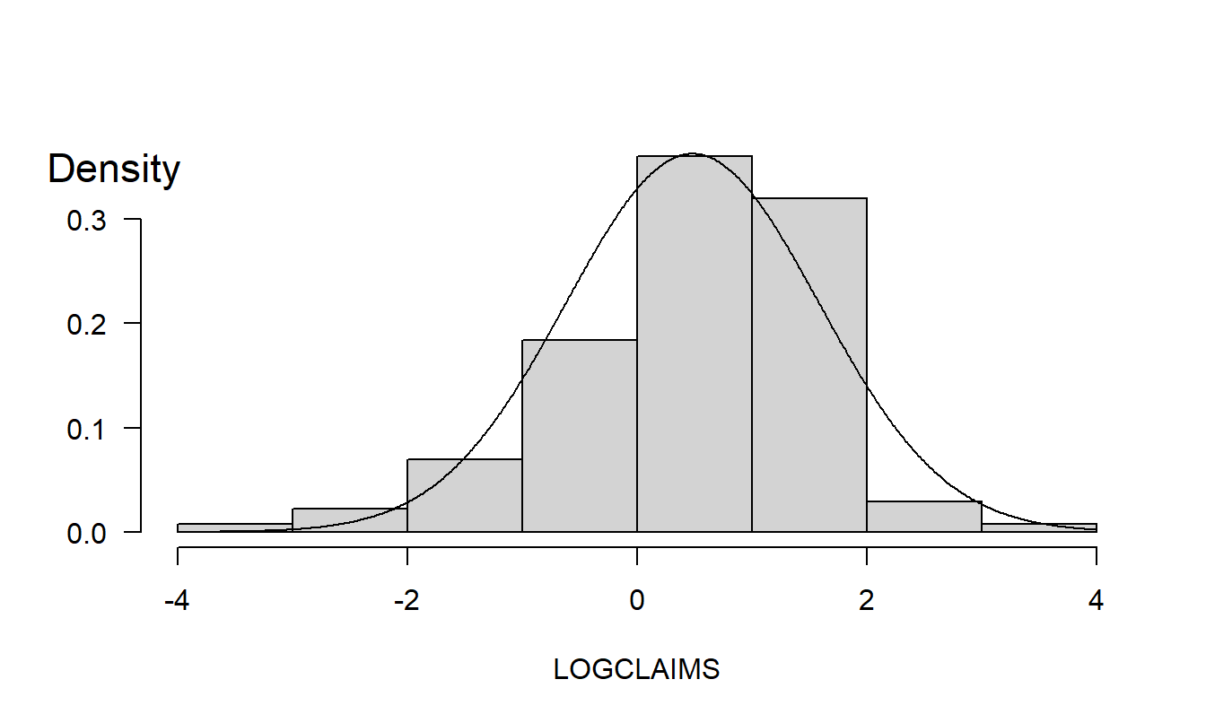
Figure 1.2: Bodily Injury Relative Frequency with Normal Curve Superimposed.
R Code to Produce Figure 1.2
Box Plot. A quick visual inspection of a variable’s distribution can reveal some surprising features that are hidden by statistics, numerical summary measures. The box plot, also known as a ‘box and whiskers’ plot, is one such graphical device. Figure 1.3 illustrates a box plot for the bodily injury claims. Here, the box captures the middle 50% of the data, with the three horizontal lines corresponding to the 75th, 50th and 25th percentiles, reading from top to bottom.
The horizontal lines above and below the box are the ‘whiskers.’ The upper whisker is 1.5 times the interquartile range (the difference between the 75th and 25th percentiles) above the 75th percentile. Similarly, the lower whisker is 1.5 times the interquartile range below the 25th percentile. Individual observations outside the whiskers are denoted by small circular plotting symbols, and are referred to as ‘outliers.’
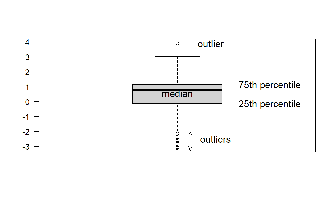
Figure 1.3: Box plot of bodily injury claims.
R Code to Produce Figure 1.3
Graphs are powerful tools; they allow analysts to readily visualize nonlinear relationships that are hard to comprehend when expressed verbally or by mathematical formula. However, by their very flexibility, graphs can also readily deceive the analyst. Chapter 21 will underscore this point. For example, Figure 1.4 is a re-drawing of Figure 1.2; the difference is that Figure 1.4 uses more, and finer, rectangles. This finer analysis reveals the asymmetric nature of the sample distribution that was not evident in Figure 1.2.
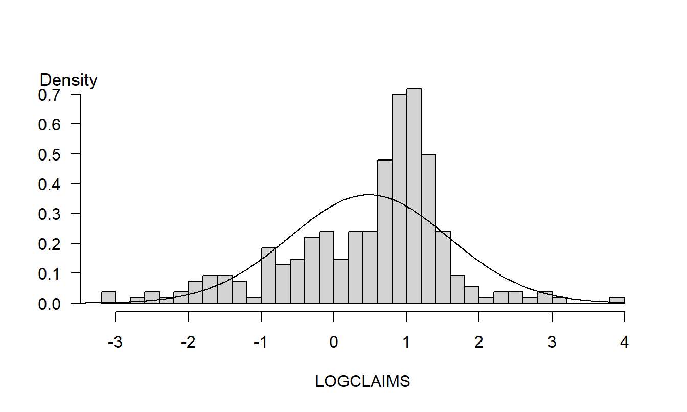
Figure 1.4: Redrawing of Figure 1.2 with an increased number of rectangles.
R Code to Produce Figure 1.4
Quantile-Quantile Plots. Increasing the number of rectangles can unmask features that were not previously apparent; however, there are in general fewer observations per rectangle meaning that the uncertainty of the relative frequency estimate increases. This represents a trade-off. Instead of forcing the analyst to make an arbitrary decision about the number of rectangles, an alternative is to use a graphical device for comparing a distribution to another known as a quantile-quantile, or qq, plot.
Figure 1.5 illustrates a \(qq\) plot for the bodily injury data using the normal curve as a reference distribution. For each point, the vertical axis gives the quantile using the sample distribution. The horizontal axis gives the corresponding quantity using the normal curve. For example, earlier we considered the 75th percentile point. This point appears as (1.168, 0.675) on the graph. To interpret a \(qq\) plot, if the quantile points lie along the superimposed line, then the sample and the normal reference distribution have the same shape. (This line is defined by connecting the 75th and 25th percentiles.)
In Figure 1.5, the small sample percentiles are consistently smaller than the corresponding values from the standard normal, indicating that the distribution is skewed to the left. The difference in values at the ends of the distribution are due to the outliers noted earlier that could also be interpreted as the sample distribution having larger tails than the normal reference distribution.
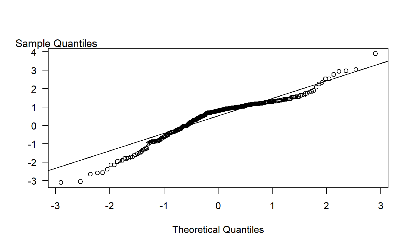
Figure 1.5: A \(qq\) plot of Bodily Injury Claims, using a normal reference distribution.
R Code to Produce Figure 1.5
Video: Section Summary
1.3 Power Transforms
In the Section 1.2 example, we considered claims without justifying the use of the logarithmic scaling. When analyzing variables such as assets of firms, wages of individuals and housing prices of households in business and economic applications, it is common to consider logarithmic instead of the original units. A log transform retains the original ordering (for example, large wages remain large on the log wage scale) but serves to ‘pull in’ extreme values of the distribution.
To illustrate, Figure 1.6 shows the bodily injury claims distribution in (thousands of) dollars. In order to graph the data meaningfully, the largest observation ($50,000) was removed prior to making this plot. Even with this observation removed, Figure 1.6 shows that the distribution is heavily lop-sided to the right, with several large values of claims appearing.
Distributions that are lopsided in one direction or the other are known as skewed. Figure 1.6 is an example of a distribution skewed to the right, or positively skewed. Here, the tail of the distribution on the right is longer and there is a greater concentration of mass to the left. In contrast, a left-skewed, or negatively skewed distribution, has a longer tail on the left and a greater concentration of mass to the right. Many insurance claims distributions are right-skewed (see the text by Klugman, Panjer and Willmot, 2008, for extensive discussions). As we saw in Figures 1.4 and 1.5, a logarithmic transformation yields a distribution that is only mildly skewed to the left.
Figure 1.6: Distribution of Bodily Injury Claims. Observations are in (thousands of) dollars with the largest observation omitted..
R Code to Produce Figure 1.6
Logarithmic transformations are used extensively in applied statistics work. One advantage is that they serve to symmetrize distributions that are skewed. More generally, we consider power transforms, also known as the Box-Cox family of transforms. Within this family of transforms, in lieu of using the response \(y\), we use a transformed, or rescaled version, \(y^{\lambda}\). Here, the power \(\lambda\) (lambda, a Greek ‘el’) is a number that may be user specified. Typical values of \(\lambda\) that are used in practice are \(\lambda\)=1, 1/2, 0 or -1. When we use \(\lambda =0\), we mean \(\ln (y)\), that is, the natural logarithmic transform. More formally, the Box-Cox family can be expressed as \[ y^{(\lambda )}=\left\{ \begin{array}{ll} \frac{y^{\lambda }-1}{\lambda } & \lambda \neq 0 \\ \ln (y) & \lambda =0 \end{array} \right. . \]
As we will see, because regression estimates are not affected by location and scale shifts, in practice we do not need to subtract one nor divide by \(\lambda\) when rescaling the response. The advantage of the above expression is that, if we let \(\lambda\) approach 0, then \(y^{(\lambda )}\) approaches \(\ln (y)\), from some straightforward calculus arguments.
To illustrate the usefulness of transformations, we simulated 500 observations from a chi-square distribution with two degrees of freedom. Appendix A3.2 introduces this distribution (that we will encounter again later in studying the behavior of test statistics). The upper left panel of Figure 1.7 shows the original distribution is heavily skewed to the right. The other panels in Figure 1.7 show the data rescaled using the square root, logarithmic and negative reciprocal transformations. The logarithmic transformation, in the lower left panel, provides the best approximation to symmetry for this example. The negative reciprocal transformation is based on \(\lambda =-1\), and then multiplying the rescaled observations by minus one, so that large observations remain large.
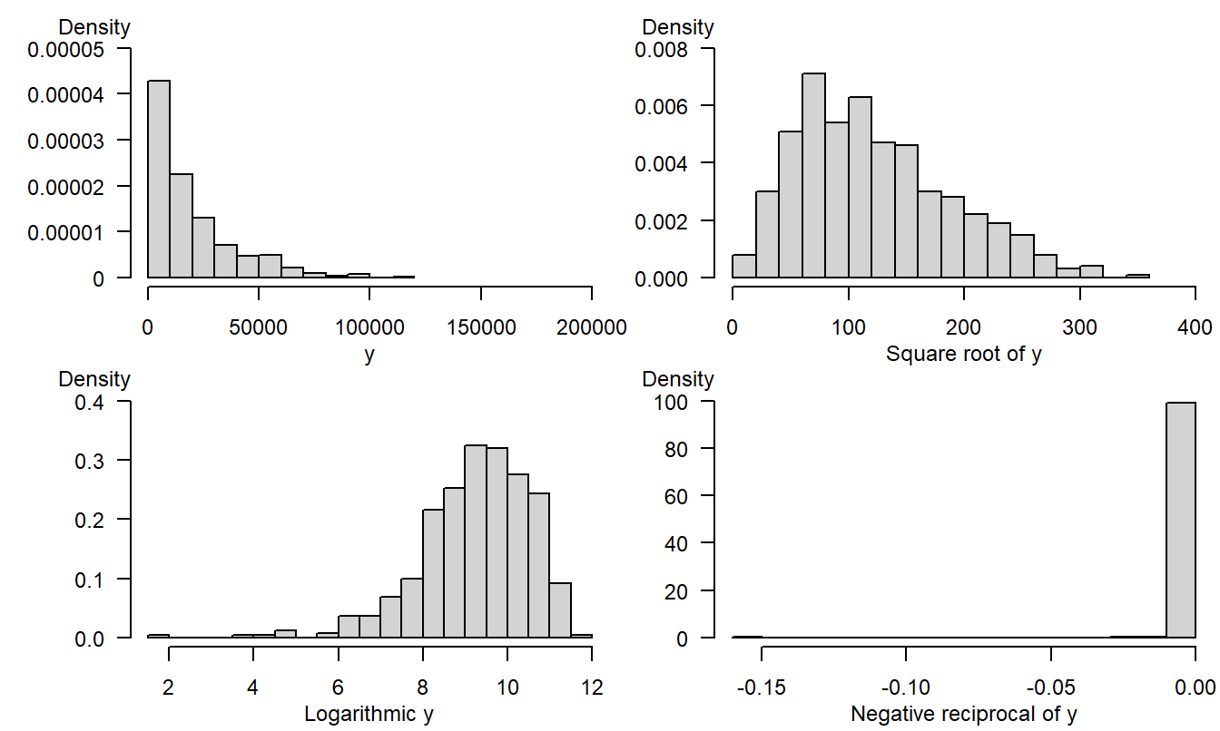
Figure 1.7: 500 simulated observations from a chi-square distribution. The upper left panel is based on the original distribution. The upper right corresponds to the square root transform, the lower left to the log transform and the lower right to the negative reciprocal transform.
R Code to Produce Figure 1.7
1.4 Sampling and the Role of Normality
A statistic is a summary measure of data, such as a mean, median or percentile. Collections of statistics are very useful for analysts, decision-makers and everyday consumers for understanding massive amounts of data that represent complex situations. To this point, our focus has been on introducing sensible techniques to summarize variables; techniques that will be used repeatedly throughout this text. However, the true usefulness of the discipline of statistics is its ability to say something about the unknown, not merely to summarize information already available. To this end, we need to make some fairly formal assumptions about the manner in which the data are observed. As a science, a strong feature of statistics (as a discipline) is the ability to critique these assumptions and offer improved alternatives in specific situations.
It is customary to assume that the data are drawn from a larger population that we are interested in describing. The process of drawing the data is known as the sampling, or data generating, process. We denote this sample as \(\{y_1,\ldots,y_n\}\). So that we may critique, and modify, these sampling assumptions, we list them below in detail:
\[ \begin{array}{l} \hline \textbf{Basic Sampling Assumptions} \\ \hline 1. ~\mathrm{E~}y_i=\mu \\ 2. ~\mathrm{Var~}y_i=\sigma ^{2} \\ 3. ~\{y_i\} \text{ are independent} \\ 4. ~\{y_i\} \text{ are normally distributed}. \\ \hline \end{array} \]
In this basic set-up, \(\mu\) and \(\sigma ^{2}\) serve as parameters that describe the location and scale of the parent population. The goal is to infer something sensible about them based on statistics such as \(\overline{y}\) and \(s_y^{2}\). For the third assumption, we assume independence among the draws. In a sampling scheme, this may be guaranteed by taking a simple random sample from a population. The fourth assumption is not required for many statistical inference procedures because central limit theorems provide approximate normality for many statistics of interest. However, a formal justification of some statistics, such as \(t\)-statistics, requires this additional assumption.
Section 1.9 provides an explicit statement of one version of the central limit theorem, giving conditions under which \(\overline{y}\) is approximately normally distributed. This section also discusses a related result, known as an Edgeworth approximation, that shows that the quality of the normal approximation is better for symmetric parent populations when compared to skewed distributions.
How does this discussion apply to the study of regression analysis? After all, so far we have focused only on the simple arithmetic average, \(\overline{y}\). In subsequent chapters, we will emphasize that linear regression is the study of weighted averages; specifically, many regression coefficients can be expressed as weighted averages with appropriately chosen weights. Central limit and Edgeworth approximation theorems are available for weighted averages - these results will ensure approximate normality of regression coefficients. To use normal curve approximations in a regression context, we will often transform variables to achieve approximate symmetry.
Video: Section Summary
1.5 Regression and Sampling Designs
Approximating normality will be an important issue in practical applications of linear regression. Parts I and II of this book focus on linear regression, where we will learn basic regression concepts and sampling design. Part III will focus on nonlinear regression, involving binary, count and fat-tailed responses, where the normal is not the most helpful reference distribution. Ideas concerning basic concepts and design will also be used in the nonlinear setting.
In regression analysis, we focus on one measurement of interest and call this the dependent variable. Other measurements are used as explanatory variables. A goal is to compare differences in the dependent variable in terms of differences in the explanatory variables. As noted in Section 1.1, regression is used extensively in many scientific fields. Table 1.3 lists alternative terms that you may encounter as you read regression applications.
Table 1.3. Terminology for Regression Variables
\[ {\small \begin{array}{ll}\hline\hline y-\text{Variable} & x-\text{Variable} \\\hline \text{Outcome of interest} & \text{Explanatory variable} \\ \text{Dependent variable} & \text{Independent variable} \\ \text{Endogenous variable} & \text{Exogenous variable} \\ \text{Response} & \text{Treatment} \\ \text{Regressand} & \text{Regressor} \\ \text{Left-hand side variable} & \text{Right-hand side variable} \\ \text{Explained variable } & \text{Predictor variable} \\ \text{Output} & \text{Input} \\ \hline \end{array} } \]
In the latter part of the nineteenth century and early part of the twentieth century, statistics was beginning to make an important impact on the development of experimental science. Experimental sciences often use designed studies, where the data are under the control of an analyst. Designed studies are performed in laboratory settings, where there are tight physical restrictions on every variable that a researcher thinks may be important. Designed studies also occur in larger field experiments, where the mechanisms for control are different than in laboratory settings. Agriculture and medicine use designed studies. Data from a designed study are said to be experimental data.
To illustrate, a classic example is to consider the yield of a crop such as corn, where each of several parcels of land (the observations) are assigned various levels of fertilizer. The goal is to ascertain the effect of fertilizer (the explanatory variable) on the corn yield (the response variable). Although researchers attempt to make parcels of land as much alike as possible, differences inevitably arise. Agricultural researchers use randomization techniques to assign different levels of fertilizer to each parcel of land. In this way, analysts can explain the variation in corn yields in terms of the variation of fertilizer levels. Through the use of randomization techniques, researchers using designed studies can infer that the treatment has a causal effect on the response. Chapter 6 discusses causality further.
Example: Rand Health Insurance Experiment. How are medical care expenditures related to the demand for insurance? Many studies have established a positive relation between the amount spent on medical care and the demand for health insurance. Those in poor health anticipate using more medical services than similarly positioned people in good or fair health and will seek higher levels of health insurance to compensate for these anticipated expenditures. They obtain this additional health insurance by (i) selecting a more generous health insurance plan from an employer, (ii) choosing an employer with a more generous health insurance plan or (iii) paying more for individual health insurance. Thus, it is difficult to disentangle the cause and effect relationship of medical care expenditures and the availability of health insurance.
A study reported by Manning et al. (1987) sought to answer this question using a carefully designed experiment. In this study, enrolled households from six cities, between November 1974 and February 1977, were randomly assigned to one of 14 different insurance plans. These plans varied by the cost-sharing elements, the co-insurance rate (the percentage paid on out-of-pocket expenditures which varied by 0, 25, 50 and 95%) as well as the deductible (5, 10 or 15 percent of family income, up to a maximum of $1,000). Thus, there was a random assignment to levels of the treatment, the amount of health insurance. The study found that more favorable plans resulted in greater total expenditures, even after controlling for participants’ health status.
For actuarial science and other social sciences, designed studies are the exception rather than the rule. For example, if we want to study the effects of smoking on mortality, it is highly unlikely that we could get study participants to agree to be randomly assigned to smoker/nonsmoker groups for several years just so that we could observe their mortality patterns! As with the Section 1.1 Galton study, social science researchers generally work with observational data. Observational data are not under control of the analyst.
With observational data, we can not infer causal relationships but we can readily introduce measures of association. To illustrate, in the Galton data, it is apparent that ‘tall’ parents are likely to have ‘tall’ children and conversely ‘short’ parents are likely to have ‘short’ children. Chapter 2 will introduce a correlation and other measures of association. However, we can not infer causality from the data. For example, there may be another variable, such as family diet, that is related to both variables. Good diet in the family could be associated with tall heights of parents and adult children, whereas poor diet stifles growth. If this were the case, we would call family diet a confounding variable.
In designed experiments such as the Rand Health Insurance Experiment, we can control for the effects of variables such as health status through random assignment methods. In observational studies, we use statistical control, rather than experimental control. To illustrate, for the Galton data, we might split our observations into two groups, one for ‘good family diet’ and one for ‘poor family diet,’ and examine the relationship between parents’ and children’s height for each subgroup. This is the essence of the regression method, to compare a \(y\) and an \(x\), ‘controlling for’ the effects of other explanatory variables.
Of course, to use statistical control and regression methods, one must record family diet, and any other measures of height that may confound the effects of parents’ height on the height of their adult child. The difficulty in designing studies is trying to imagine all of the variables that could possibly affect a response variable, an impossible task in most social science problems of interest. To give some guidance on when ‘enough is enough,’ Chapter 6 will discuss measures of an explanatory variable’s importance and its impact on model selection.
1.6 Actuarial Applications of Regression
This book introduces a statistical method, regression analysis. The introduction is organized around the traditional triad of statistical inference:
- hypothesis testing,
- estimation and
- prediction.
Further, this book shows how this methodology can be used in applications that are likely to be of interest to actuaries and to other risk analysts. As such, it is helpful to begin with the three traditional areas of actuarial applications:
- pricing,
- reserving and
- solvency testing.
Pricing and adverse selection. Regression analysis can be used to determine insurance prices for many lines of business. For example, in private passenger automobile insurance, expected claims vary by the insured’s gender, age, location (city versus rural), vehicle purpose (work or pleasure) and a host of other explanatory variables. Regression can be used to identify the variables that are important determinants of expected claims.
In competitive markets, insurance companies do not use the same price for all insureds. If they did, ‘good risks,’ those with lower than average expected claims, would overpay and leave the company. In contrast, ‘bad risks,’ those with higher than average expected claims, would remain with the company. If the company continued this flat rate pricing policy, premiums would rise (to compensate for claims by the increasing share of bad risks) and market share would dwindle as the company loses good risks. This problem is known as ‘adverse selection.’ Using an appropriate set of explanatory variables, classification systems can be developed so that each insured pays their fair share.
Reserving and solvency testing. Both reserving and solvency testing are concerned with predicting whether liabilities associated with a group of policies will exceed the capital devoted to meeting obligations arising from the policies. Reserving involves determining the appropriate amount of capital to meet these obligations. Solvency testing is about assessing the adequacy of capital to fund the obligations for a block of business. In some practice areas, regression can be used to forecast future obligations to help determine reserves (see, for example, Chapter 19). Regression can also be used to compare characteristics of healthy and financially distressed firms for solvency testing (see, for example, Chapter 14).
Other risk management applications. Regression analysis is a quantitative tool that can be applied in a broad variety of business problems, not just the traditional areas of pricing, reserving and solvency testing. By becoming familiar with regression analysis, actuaries will have another quantitative skill that can be brought to bear on general problems involving the financial security of people, companies and governmental organizations. To help you develop insights, this book provides many examples of potential ‘non-actuarial’ applications through featured vignettes labeled as ‘examples’ and illustrative data sets.
To help understand potential regression applications, start by reviewing the several data sets featured in the Chapter 1 Exercises. Even if you do not complete the exercises to strengthen your data summary skills (that require the use of a computer), a review of the problem descriptions will help you become more familiar with types of applications in which an actuary might use regression techniques.
Video: Section Summary
1.7 Further Reading and References
This book introduces regression and time series tools that are most relevant to actuaries and other financial risk analysts. Fortunately, there are other sources that provide excellent introductions to these statistical topics (although not from a risk management viewpoint). Particularly for analysts that intend to specialize in statistics, it is helpful to get another perspective. For regression, I recommend Weisburg (2005) and Faraway (2005). For time series, Diebold (2004) is a good source. Moreover, Klugman, Panjer and Willmot (2008) provides a good introduction to actuarial applications of statistics; this book is intended to complement the Klugman et al. book by focusing on regression and time series methods.
Chapter References
- Beard, Robert E., Teivo Pentikäinen and Erkki Pesonen (1984). Risk Theory: The Stochastic Basis of Insurance (Third Edition). Chapman & Hall, New York.
- Diebold, Francis. X. (2004). Elements of Forecasting, Third Edition. Thomson, South-Western, Mason, Ohio.
- Faraway, Julian J. (2005). Linear Models in R. Chapman & Hall/CRC, New York.
- Hogg, Robert V. (1972). On statistical education. The American Statistician 26, 8-11.
- Klugman, Stuart A, Harry H. Panjer and Gordon E. Willmot (2008). Loss Models: From Data to Decisions. John Wiley & Sons, Hoboken, New Jersey.
- Manning, Willard G., Joseph P. Newhouse, Naihua Duan, Emmett B. Keeler, Arleen Leibowitz and M. Susan Marquis (1987). Health insurance and the demand for medical care: Evidence from a randomized experiment. American Economic Review 77, No. 3, 251-277.
- Rempala, Grzegorz A. and Richard A. Derrig (2005). Modeling hidden exposures in claim severity via the EM algorithm. North American Actuarial Journal 9, No. 2, 108-128.
- Singer, Judith D. and Willett, J. B. (1990). Improving the teaching of applied statistics: Putting the data back into data analysis. The American Statistician 44, 223-230.
- Stigler, Steven M. (1986). The History of Statistics: The Measurement of Uncertainty before 1900. The Belknap Press of Harvard University Press, Cambridge, MA.
- Weisberg, Sanford (2005). Applied Linear Regression, Third Edition. John Wiley & Sons, New York.
1.8 Exercises
1.1 MEPS health expenditures. This exercise considers data from the Medical Expenditure Panel Survey (MEPS), conducted by the U.S. Agency of Health Research and Quality. MEPS is a probability survey that provides nationally representative estimates of health care use, expenditures, sources of payment, and insurance coverage for the U.S. civilian population. This survey collects detailed information on individuals of each medical care episode by type of services including physician office visits, hospital emergency room visits, hospital outpatient visits, hospital inpatient stays, all other medical provider visits, and use of prescribed medicines. This detailed information allows one to develop models of health care utilization to predict future expenditures. You can learn more about MEPS at http://www.meps.ahrq.gov/mepsweb/.
We consider MEPS data from the panels 7 and 8 of 2003 that consists of 18,735 individuals between ages 18 and 65. From this sample, we took a random sample of 2,000 individuals that appear in the file ‘HealthExpend’. From this sample, there are 157 individuals that had positive inpatient expenditures. There are also 1,352 that had positive outpatient expenditures. We will analyze these two samples separately.
Our dependent variables consist of amounts of expenditures for inpatient (EXPENDIP) and outpatient (EXPENDOP) visits. For MEPS, outpatient events include hospital outpatient department visits, office-based provider visits and emergency room visits excluding dental services. (Dental services, compared to other types of health care services, are more predictable and occur in a more regular basis.) Hospital stays with the same date of admission and discharge, known as ‘zero-night stays,’ were included in outpatient counts and expenditures. (Payments associated with emergency room visits that immediately preceded an inpatient stay were included in the inpatient expenditures. Prescribed medicines that can be linked to hospital admissions were included in inpatient expenditures, not in outpatient utilization.)
Part 1: Use only the 157 individuals that had positive inpatient expenditures and do the following analysis.
- Compute descriptive statistics for inpatient (EXPENDIP)
expenditures.
- a(i). What is the typical (mean and median) expenditure?
- a(ii). How does the standard deviation compare to the mean? Do the data appear to be skewed?
- Compute a box plot, histogram and a (normal) \(qq\) plot for EXPENDIP. Comment on the shape of the distribution.
- Transformations.
- c(i). Take a square root transform of inpatient expenditures. Summarize the resulting distribution using a histogram and a \(qq\) plot. Does it appear to be approximately normally distributed?
- c(ii). Take a (natural) logarithmic transformation of inpatient expenditures. Summarize the resulting distribution using a histogram and a \(qq\) plot. Does it appear to be approximately normally distributed?
Part 2: Use only the 1,352 individuals that had positive outpatient expenditures.
- Repeat part (a) and compute histograms for expenditures and logarithmic expenditures. Comment on the approximate normality for each histogram.
1.2 Nursing Home Utilization. This exercise considers nursing home data provided by the Wisconsin Department of Health and Family Services (DHFS). The State of Wisconsin Medicaid program funds nursing home care for individuals qualifying on the basis of need and financial status. As part of the conditions for participation, Medicaid-certified nursing homes must file an annual cost report to DHFS, summarizing the volume and cost of care provided to all of its residents, Medicaid-funded and otherwise. These cost reports are audited by DHFS staff and form the basis for facility-specific Medicaid daily payment rates for subsequent periods. The data are publicly available; see [http://dhs.wisconsin.gov] for more information.
The DHFS is interested in predictive techniques that provide reliable utilization forecasts to update their Medicaid funding rate schedule of nursing facilities. In this assignment, we consider the data in the file ‘WiscNursingHome’ in cost report years 2000 and 2001. There are 362 facilities in 2000 and 355 facilities in 2001. Typically, utilization of nursing home care is measured in patient days (‘patient days’ is the number of days each patient was in the facility, summed over all patients). For this exercise, we define the outcome variable to be total patient years (TPY), the number of total patient days in the cost reporting period divided by number of facility operating days in the cost reporting period (see Rosenberg et al., 2007, Appendix 1, for further discussion of this choice). The number of beds (NUMBED) and square footage (SQRFOOT) of the nursing home both measure the size of the facility. Not surprisingly, these variables will be important predictors of TPY.
Part 1: Use cost report year 2000 data, and do the following analysis.
- Compute descriptive statistics for TPY, NUMBED, and SQRFOOT.
- Summarize the distribution of TPY using a histogram and a \(qq\) plot. Does it appear to be approximately normally distributed?
- Transformations. Take a (natural) logarithmic transformation of TPY (LOGTPY). Summarize the resulting distribution using a histogram and a \(qq\) plot. Does it appear to be approximately normally distributed?
Part 2: Use cost report year 2001 data and repeat parts (a) and (c).
1.3 Automobile Insurance Claims. As an actuarial analyst, you are working with a large insurance company to help them understand their claims distribution for their private passenger automobile policies. You have available claims data for a recent year, consisting of:
- STATE CODE: codes 01 through 17 used, with each code randomly assigned to an actual individual state
- CLASS: rating class of operator, based on age, gender, marital status and use of vehicle
- GENDER: operator gender AGE: operator age
- PAID: amount paid to settle and close a claim.
You are focusing on older drivers, 50 and higher, for which there are \(n = 6,773\) claims available.
Examine the histogram of the amount PAID and comment on the symmetry. Create a new variable, the (natural) logarithmic claims paid, LNPAID. Create a histogram and a \(qq\) plot of LNPAID. Comment on the symmetry of this variable.
1.4 Hospital Costs. Suppose that you are an employee benefits actuary working with a medium size company in Wisconsin. This company is considering offering, for the first time in their industry, hospital insurance coverage to dependent children of their employees. You have access to company records and so have available the number, age and gender of the dependent children but have no other information about hospital costs from the company. In particular, no firm in this industry has offered this coverage and so you have little historical industry experience upon which you can forecast expected claims.
You gather data from the Nationwide Inpatient Sample of the Healthcare Cost and Utilization Project (NIS-HCUP), a nationwide survey of hospital costs conducted by the US Agency for Healthcare Research and Quality (AHRQ). You restrict consideration to Wisconsin hospitals and analyze a random sample of \(n=500\) claims from 2003 data. Although the data comes from hospital records, it is organized by individual discharge and so you have information about the age and gender of the patient discharged. Specifically, you consider patients aged 0-17 years. In a separate project, you will consider the frequency of hospitalization. For this project, the goal is to model the severity of hospital charges, by age and gender.
- Examine the distribution of the dependent variable, TOTCHG. Do this by making a histogram and then a \(qq\) plot, comparing the empirical to a normal distribution.
- Take a natural log transformation and call the new variable LNTOTCHG. Examine the distribution of this transformed variable. To visualize the logarithmic relationship, plot LNTOTCHG versus TOTCHG.
1.5 Automobile injury insurance claims. We consider automobile injury claims data using data from the Insurance Research Council (IRC), a division of the American Institute for Chartered Property Casualty Underwriters and the Insurance Institute of America. The data, collected in 2002, contains information on demographic information about the claimant, attorney involvement and the economic loss (LOSS, in thousands), among other variables. We consider here a sample of \(n=1,340\) losses from a single state. The full 2002 study contains over 70,000 closed claims based on data from thirty-two insurers. The IRC conducted similar studies in 1977, 1987, 1992 and 1997.
- Compute descriptive statistics for the total economic loss (LOSS). What is the typical loss?
- Compute a histogram and (normal) \(qq\) plot for LOSS. Comment on the shape of the distribution.
- Partition the data set into two subsamples, one corresponding to
those claims that involved an ATTORNEY (=1) and the other where an
ATTORNEY was not involved (=2).
- c(i). For each subsample, compute the typical loss. Does there appear to be a difference in the typical losses by attorney involvement?
- c(ii) To compare the distributions, compute a boxplot by level of attorney involvement.
- c(iii). For each subsample, compute a histogram and \(qq\) plot. Compare the two distributions to one another.
1.6 Insurance Company Expenses. Like other businesses, insurance companies seek to minimize expenses associated with doing business in order to enhance profitability. To study expenses, this exercise examines a random sample of 500 insurance companies from the National Association of Insurance Commissioners (NAIC) database of over 3,000 companies. The NAIC maintains one of the world’s largest insurance regulatory databases; we consider here data that are based on 2005 annual reports for all the property and casualty insurance companies in the United States. The annual reports are financial statements that use statutory accounting principles.
Specifically, our dependent variable is EXPENSES, the non-claim expenses for a company. Although not needed for this exercise, non-claim expenses are based on three components: unallocated loss adjustment, underwriting and investment expenses. The unallocated loss adjustment expense is the expense not directly attributable to a claim but is indirectly associated with settling claims; it includes items such as the salaries of claims adjusters, legal fees, court costs, expert witnesses and investigation costs. Underwriting expenses consists of policy acquisition costs, such as commissions, as well as the portion of administrative, general and other expenses attributable to underwriting operations. Investment expense are those expenses related to investment activities of the insurer.
- Examine the distribution of the dependent variable, EXPENSES. Do this by making a histogram and then a \(qq\) plot, comparing the empirical to a normal distribution.
- Take a natural log transformation and examine the distribution of this transformed variable. Has the transformation helped to symmetrize the distribution?
1.7 National Life Expectancies. Who is doing health care right? Health care decisions are made at the individual, corporate and government levels. Virtually every person, corporation and government have their own perspective on health care; these different perspectives result in a wide variety of systems for managing health care. Comparing different health care systems help us learn about approaches other than our own, which in turn help us make better decisions in designing improved systems.
Here, we consider health care systems from \(n=185\) countries
throughout the world. As a measure of the quality of care, we use
LIFEEXP, the life expectancy at birth. This dependent variable, with
several explanatory variables, are listed in Table 1.4. From this table, you will note that
although there are 185 countries considered in this study, not all
countries provided information for each variable. Data not available
are noted under the column Num Miss. The data are from the
United Nations (UN) Human Development Report.
- Examine the distribution of the dependent variable, LIFEEXP. Do this by making a histogram and then a \(qq\) plot, comparing the empirical to a normal distribution.
- Take a natural log transformation and examine the distribution of this transformed variable. Has the transformation helped to symmetrize the distribution?
Table 1.4. Life Expectancy, Economic and Demographic Characteristics of 185 Countries
\[ \small{ \begin{array}{ll|crrrrr} \hline & & Num & & & Std & Mini- & Maxi- \\ Variable & Description & Miss & Mean & Median & Dev & mum & mum \\\hline BIRTH & \text{ Births attended by skilled} & 7 & 78.25 & 92.00 & 26.42 & 6.00 & 100.00 \\ ~~ATTEND& ~~ \text{ health personnel} (\%)\\ FEMALE & \text{ Legislators, senior officials} & 87 & 29.07 & 30.00 & 11.71 & 2.00 & 58.00 \\ ~~BOSS& ~~ \text{ and managers, % female }\\ FERTILITY & \text{ Total fertility rate,}& 4 & 3.19 & 2.70 & 1.71 & 0.90 & 7.50 \\ & ~~ \text{ births per woman }& \\ GDP & \text{ Gross domestic product,} & 7 & 247.55 & 14.20 & 1,055.69 & 0.10 & 12,416.50 \\ & ~~\text{ in billions of USD} \\ HEALTH& \text{ 2004 Health expenditure} & 5 & 718.01 & 297.50 & 1,037.01 & 15.00 & 6,096.00 \\ ~~ EXPEND & ~~ \text{ per capita, PPP in USD} \\ ILLITERATE & \text{ Adult illiteracy rate,} & 14 & 17.69 & 10.10 & 19.86 & 0.20 & 76.40 \\ & ~~ \% \text{ aged 15 and older} & \\ PHYSICIAN & \text{ Physicians,}& 3 & 146.08 & 107.50 & 138.55 & 2.00 & 591.00 \\ & ~~ \text{ per 100,000 people} \\ POP & \text{ 2005 population,} & 1 & 35.36 & 7.80 & 131.70 & 0.10 & 1,313.00 \\ & ~~\text{ in millions }\\ PRIVATE & \text{ 2004 Private expenditure} & 1 & 2.52 & 2.40 & 1.33 & 0.30 & 8.50 \\ ~~HEALTH& ~~\text{on health, % of GDP} \\ PUBLIC & \text{ Public expenditure} & 28 & 4.69 & 4.60 & 2.05 & 0.60 & 13.40 \\ ~~EDUCATION& ~~ \text{ on education, % of GDP} \\ RESEAR & \text{ Researchers in R & D,} & 95 & 2,034.66 & 848.00 & 4,942.93 & 15.00 & 45,454.00 \\ ~~CHERS&~~ \text{ per million people} & \\ SMOKING & \text{ Prevalence of smoking,} & 88 & 35.09 & 32.00 & 14.40 & 6.00 & 68.00 \\ & ~~\text{ (male) % of adults } \\ \hline LIFEEXP & \text{ Life expectancy at birth,}& & 67.05 & 71.00 & 11.08 & 40.50 & 82.30 \\ & ~~ \text{ in years } \\ \hline \end{array} } \]
Source: United Nations Human Development Report, available at http://hdr.undp.org/en/ .
1.9 Technical Supplement - Central Limit Theorem
Central limit theorems form the basis for much of the statistical inference used in regression analysis. Thus, it is helpful to provide an explicit statement of one version of the central limit theorem.
Central Limit Theorem. Suppose that \(y_1,\ldots,y_n\) are independently distributed with mean \(\mu\), finite variance \(\sigma ^{2}\) and \(\mathrm{E}|y|^{3}\) is finite. Then, \[ \lim_{n\rightarrow \infty }\Pr \left( \frac{\sqrt{n}}{\sigma }(\overline{y} -\mu )\leq x\right) =\Phi \left( x\right) , \] for each \(x,\) where \(\Phi \left( .\right)\) is the standard normal distribution function.
Under the assumptions of this theorem, the re-scaled distribution of \(\overline{y}\) approaches a standard normal as the sample size, \(n\), increases. We interpret this as meaning that, for ‘large’ sample sizes, the distribution of \(\overline{y}\) may be approximated by a normal distribution. Empirical investigations have shown that sample sizes of \(n=25\) through 50 provide adequate approximations for most purposes.
When does the central limit theorem not work well? Some insights are provided by another result from mathematical statistics.
Edgeworth Approximation. Suppose that \(y_1,\ldots, y_n\) are identically and independently distributed with mean \(\mu\), finite variance \(\sigma ^{2}\) and \(\mathrm{E}|y|^{3}\) is finite. Then, \[ \Pr \left( \frac{\sqrt{n}}{\sigma }(\overline{y}-\mu )\leq x\right) =\Phi \left( x\right) +\frac{1}{6}\frac{1}{\sqrt{2\pi }}e^{-x^{2}/2}\frac{\mathrm{E }(y-\mu )^{3}}{\sigma ^{3}\sqrt{n}}+\frac{h_n}{\sqrt{n}}, \] for each \(x,\) where \(h_n\rightarrow 0\) as \(n\rightarrow \infty .\)
This result suggests that the distribution of \(\bar{y}\) becomes closer to a normal distribution as the skewness, \(\mathrm{E}(\overline{y} -\mu )^{3}\), becomes closer to zero. This is important in insurance applications because many distributions tend to be skewed. Historically, analysts used the second term on the right-hand side of the result to provide a ‘correction’ for the normal curve approximation. See, for example, Beard, Pentikäinen and Pesonen (1984) for further discussion of Edgeworth approximations in actuarial science. An alternative (used in this book) that we saw in Section 1.3 is to transform the data, thus achieving approximate symmetry. As suggested by the Edgeworth approximation theorem, if our parent population is close to symmetric, then the distribution of \(\overline{y}\) will be approximately normal.