Chapter 20 Report Writing: Communicating Data Analysis Results
Chapter Preview. Statistical reports should be accessible to different types of readers. These reports inform managers who desire broad overviews in nontechnical language as well as analysts who require technical details in order to replicate the study. This chapter summarizes methods of writing and organizing statistical reports. To illustrate, we will consider a report of claims from third party automobile insurance.
20.1 Overview
The last relationship has been explored, the last parameter has been estimated, the last forecast has been made, and now you are ready to share the results of your statistical analysis with the world. The medium of communication can come in many forms: you may simply recommend to a client to “buy low, sell high” or give an oral presentation to your peers. Most likely, however, you will need to summarize your findings in a written report.
Communicating technical information is difficult for a variety of reasons. First, in most data analyses there is no one “right” answer that the author is trying to communicate to the reader. To establish a “right” answer, one only need position the pros and cons of an issue and weigh their relative merits. In statistical reports, the author is trying to communicate data features and the relationship of the data to more general patterns, a much more complex task. Second, most reports written are directed to a primary client, or audience. In contrast, statistical reports are often read by many different readers whose knowledge of statistical concepts varies extensively; it is important to take into consideration the characteristics of this heterogeneous readership when judging the pace and order in which the material is presented. This is particularly difficult when a writer can only guess whom the secondary audience may be. Third, authors of statistical reports need to have a broad and deep knowledge base, including a good understanding of underlying substantive issues, knowledge of statistical concepts and language skills. Drawing on these different skill sets can be challenging. Even for a generally effective writer, any confusion in the analysis is inevitably reflected in the report.
Communication of data analysis results can be a brief oral recommendation to a client or a 500-page Ph.D. dissertation. However, a 10- to 20-page report summarizing the main conclusions and outlining the details of the analysis suffices for most business purposes. One key aspect of such a report is to provide the reader with an understanding of the salient features of the data. Enough details of the study should be provided so that the analysis could be independently replicated with access to the original data.
20.2 Methods for Communicating Data
To allow readers to interpret numerical information effectively, data should be presented using a combination of words, numbers and graphs that reveal its complexity. Thus, the creators of data presentations must draw on background skills from several areas including:
- an understanding of the underlying substantive area,
- a knowledge of the related statistical concepts,
- an appreciation of design attributes of data presentations and
- an understanding of the characteristics of the intended audience.
This balanced background is vital if the purpose of the data presentation is to inform. If the purpose is to enliven the data (“because data are inherently boring”) or to attract attention, then the design attributes may take on a more prominent role. Conversely, some creators with strong quantitative skills take great pains to simplify data presentations in order to reach a broad audience. By not using the appropriate design attributes, they reveal only part of the numerical information and hide the true story of their data. To quote Albert Einstein, “You should make your models as simple as possible, but no simpler.”
This section presents the basic elements and rules for constructing successful data presentations. To this end, we discuss three modes of presenting numerical information: (i) within-text data, (ii) tabular data and (iii) data graphics. These three modes are ordered roughly in the complexity of data that they are designed to present; from the within text data mode that is most useful for portraying the simplest types of data, up to the data graphics mode that is capable of conveying numerical information from extremely large sets of data.
Within Text Data
Within text data simply means numerical quantities that are cited within the usual sentence structure. For example:
The price of Vigoro stock today is $36.50 per share, a record high.
When presenting data within text, you will have to decide whether to use figures or spell out a particular number. There are several guidelines for choosing between figures and words, although generally for business writing you will use words if this choice results in a concise statement. Some of the important guidelines include:
- Spell out whole numbers from one to ninety-nine.
- Use figures for fractional numbers.
- Spell out round numbers that are approximations.
- Spell out numbers that begin a sentence.
- Use figures in sentences that contain several numbers.
For example:
There are forty-three students in my class.With 0.2267 U.S. dollars, I can buy one Swedish kroner.There are about forty-three thousand students at this university.Three thousand, four hundred and fifty-six people voted for me.Those boys are 3, 4, 6 and 7 years old.
Text flows linearly; this makes it difficult for the reader to make comparisons of data within a sentence. When lists of numbers become long or important comparisons are to be made, a useful device for presenting data is the within text table, also called the semitabular form. For example:
For 2005, net premiums by major line of business written by property and casualty insurers in billions of US dollars, were:
- Private passenger auto — 159.57
- Homeowners multiple peril — 53.01
- Workers’ compensation — 39.73
- Other lines — 175.09.
(Source: The Insurance Information Institute Fact Book 2007.)
Tables
When the list of numbers is longer, the tabular form, or table, is the preferred choice for presenting data. The basic elements of a table appear in Table 20.1.
Table 20.1. Summary Statistics of Stock Liquidity Variables
\[ \small{ \begin{array}{lrrrrr} \hline & & & \text{Standard} & & \\ & \text{Mean} & \text{Median} & \text{deviation} &\text{ Minimum} & \text{Maximum} \\ \hline \text{VOLUME} & 13.423 & 11.556 & 10.632 & 0.658 & 64.572 \\ \text{AVG}T & 5.441 & 4.284 & 3.853 & 0.590 & 20.772 \\ \text{NTRAN} & 6436 & 5071 & 5310 & 999 & 36420 \\ \text{PRICE} & 38.80 & 34.37 & 21.37 & 9.12 & 122.37 \\ \text{SHARE} & 94.7 & 53.8 & 115.1 & 6.7 & 783.1 \\ \text{VALUE} & 4.116 & 2.065 & 8.157 & 0.115 & 75.437 \\ \text{DEB_EQ} & 2.697 & 1.105 & 6.509 & 0.185 & 53.628 \\\hline \\ \hline \end{array} } \] Source: Francis Emory Fitch, Inc., Standard & Poor’s Compustat, and University of Chicago’s Center for Research on Security Prices.
These are:
- Title. A short description of the data, placed above or to the side of the table. For longer documents, provide a table number for easy reference within the main body of the text. The title may be supplemented by additional remarks, thus forming a caption.
- Column Headings. Brief indications of the material in the columns.
- Stub. The left hand vertical column. It often provides identifying information for individual row items.
- Body. The other vertical columns of the table.
- Rules. Lines that separate the table into its various components.
- Source. Provides the origin of the data.
As with the semitabular form, tables can be designed to enhance comparisons between numbers. Unlike the semitabular form, tables are separate from the main body of the text. Because they are separate, tables should be self-contained so that the reader can draw information from the table with little reference to the text. The title should draw attention to the important features of the table. The layout should guide the reader’s eye and facilitate comparisons. Table 20.1 illustrates the application of some basic rules for constructing “user friendly” tables. These rules include:
- For titles and other headers, STRINGS OF CAPITALS ARE DIFFICULT TO READ, keep these to a minimum.
- Reduce the physical size of a table so that the eye does not have to travel as far as it might otherwise; use single spacing and reduce the type size.
- Use columns for figures to be compared rather than rows; columns are easier to compare, although this makes documents longer.
- Use row and column averages and totals to provide focus. This allows readers to make comparisons.
- When possible, order rows and/or columns by size in order to facilitate comparisons. Generally, ordering by alphabetical listing of categories does little for understanding complex data sets.
- Use combinations of spacing and horizontal and vertical rules to facilitate comparisons. Horizontal rules are useful for separating major categories; vertical rules should be used sparingly. White space between columns serves to separate categories; closely spaced pairs of columns encourage comparison.
- Use tinting and different type size and attributes to draw attention to figures. Use of tint is also effective for breaking up the monotonous appearance of a large table.
- The first time that the data are displayed, provide the source.
Graphs
For portraying large, complex data sets, or data where the actual numerical values are less important than the relations to be established, graphical representations of data are useful. Figure 20.1 describes some of the basic elements of a graph, also known as a chart, illustration or figure. These include:
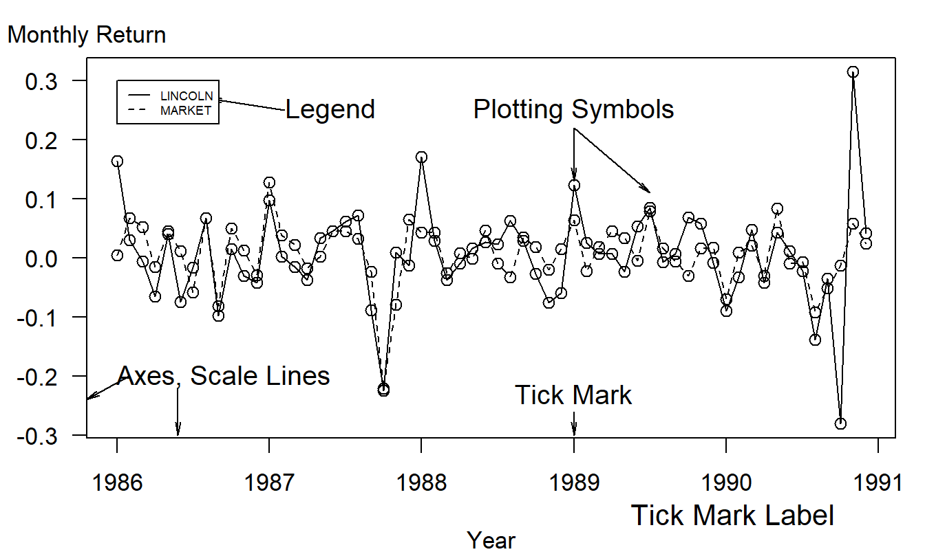
Figure 20.1: Time series plot of returns from the Lincoln National Corporation and the market. There are 60 monthly returns over the period January, 1986 through December, 1990.
- Title and Caption. As with a table, these provide short descriptions of the main features of the figure. Long captions may be used to describe everything that is being graphed, draw attention to the important features and describe the conclusions to be drawn from the data. Include the source of the data here or on a separate line immediately below the graph.
- Scale Lines (Axes) and Scale Labels. Choose the scales so that the data fill up as much of the data region as possible. Do not insist that zero be included; assume that the viewer will look at the range of the scales and understand them.
- Tick Marks and Tick Mark Labels. Choose the range of the tick marks to include almost all of the data. Three to ten tick marks are generally sufficient. When possible put the tick outside of the data region, so that they do not interfere with the data.
- Plotting Symbols. Use different plotting symbols to encode different levels of a variable. Plotting symbols should be chosen so that they are easy to identify, for example, “O” for one and “T” for two. However, be sure that plotting symbols are easy to distinguish; for example, it can be difficult to distinguish “F” and “E”.
- Legend (Keys). These are small textual displays that help to identify certain aspects of the data. Do not let these displays interfere with the data or clutter the graph.
As with tables, graphs are separate from the main body of the text and thus should be self-contained. Especially with long documents, tables and graphs may contain a separate story line, providing a look at the main message of the document in a different way than the main body of the text. Cleveland (1994) and Tufte (1990) provide several tips to make graphs more “user-friendly.”
- Make lines as thin as possible. Thin lines distract the eye less from the data when compared to thicker lines. However, make the lines thick enough so that the image will not degrade under reproduction.
- Try to use as few lines as possible. Again, several lines distract the eye from the data, which carries the information. Try to avoid “grid” lines, if possible. If you must use grid lines, a light ink, such as a gray or half tone, is the preferred choice.
- Spell out words and avoid abbreviations. Rarely is the space saved worth the potential confusion that the shortened version may cause the viewer.
- Use a type that includes both capital and small letters.
- Place graphs on the same page as the text that discusses the graph.
- Make words run from left to right, not vertically.
- Use the substance of the data to suggest the shape and size of the graph. For time series graphs, make the graph twice as wide as tall. For scatter plots, make the graph equally wide as tall. If a graph displays an important message, make the graph large.
Of course, for most graphs it will be impossible to follow all these pieces of advice simultaneously. To illustrate, if we spell out the scale label on a left hand vertical axis and make it run from left to right, then we cut into the vertical scale. This forces us to reduce the size of the graph, perhaps at the expense of reducing the message.
A graph is a powerful tool for summarizing and presenting numerical information. Graphs can be used to break up long documents; they can provoke and maintain reader interest. Further, graphs can reveal aspects of the data that other methods cannot.
20.3 How to Organize
Writing experts agree that results should be reported in an organized fashion with some logical flow, although there is no consensus as to how this goal should be achieved. Every story has a beginning and an end, usually with an interesting path connecting the two endpoints. There are many types of paths, or methods of development, that connect the beginning and the end. For general technical writing, the method of development may be organized chronologically, spatially, by order of importance, general-to-specific or specific-to-general, by cause-and-effect or any other logical development of the issues. This section presents one method of organization for statistical report writing that has achieved desirable results in a number of different circumstances, including the 10- to 20-page report described previously. This format, although not appropriate for all situations, serves as a workable framework on which to base your first statistical report.
The broad outline of the recommended format is:
- Title and Abstract
- Introduction
- Data Characteristics
- Model Selection and Interpretation
- Summary and Concluding Remarks
- References and Appendix
Sections (1) and (2) serve as the preparatory material, designed to orient the reader. Sections (3) and (4) form the main body of the report while Sections (5) and (6) are parts of the ending.
Title and Abstract
If your report is disseminated widely (as you hope), here is some disappointing news. A vast majority of your intended audience gets no further than the title and the abstract. Even for readers who carefully read your report, they will usually carry in their memory the impressions left by the title and abstract unless they are experts in the subject that you are reporting on (which most readers will not be). Choose the title of your report carefully. It should be concise and to the point. Do not include deadwood (phrases like The Study of, An Analysis of) but do not be too brief, for example, by using only one word titles. In addition to being concise, the title should be comprehensible, complete and correct.
The abstract is a one- to two-paragraph summary of your investigation; 75 to 200 words are reasonable rules of thumb. The language should be nontechnical as you are trying to reach as broad an audience as possible. This section should summarize the main findings of your report. Be sure to respond to such questions as: What problem was studied? How was it studied? What were the findings? Because you are summarizing not only your results but also your report, it is generally most efficient to write this section last.
Introduction
As with the general report, the introduction should be partitioned into three sections: orientation material, key aspects of the report and a plan of the paper.
To begin the orientation material, re-introduce the problem at the level of technicality that you wish to use in the report. It may or may not be more technical than the statement of the problem in the abstract. The introduction sets the pace, or the speed at which new ideas are introduced, in the report. Throughout the report, be consistent in the pace. To clearly identify the nature of the problem, in some instances a short literature review is appropriate. The literature review cites other reports that provide insights on related aspects of the same problem. This helps to crystallize the new features of your report.
As part of the key aspects of the report, identify the source and nature of the data used in your study. Make sure that the manner in which your data set can address the stated problem is apparent. Give an indication of the class of modeling techniques that you intend to use. Is the purpose behind this model selection clear (for example, understanding versus forecasting)?
At this point, things can get a bit complex for many readers. It is a good idea to provide an outline of the remainder of the report at the close of the introduction. This provides a map to guide the reader through the complex arguments of the report. Further, many readers will be interested only in specific aspects of the report and, with the outline, will be able to “fast-forward” to the sections that interest them most.
Data Characteristics
In a data analysis project, the job is to summarize the data and use this summary information to make inferences about the state of the world. Much of this summarization is done through statistics that are used to estimate model parameters. However, it is also useful to describe the data without reference to a specific model for at least two reasons. First, by using basic summary measures of the data, you can appeal to a larger audience than if you had restricted your considerations to a specific statistical model. Indeed, with a carefully constructed graphical summary device, you should be able to reach virtually any reader who is interested in the subject material. Conversely, familiarity with statistical models requires a certain amount of mathematical sophistication and you may or may not wish to restrict your audience at this stage of the report. Second, constructing statistics that are immediately connected to specific models leaves you open to the criticism that your model selection is incorrect. For most reports, the selection of a model is an unavoidable juncture in the process of inference but you need not do it at this relatively early stage of your report.
In the data characteristics section, identify the nature of data. For example, be sure to identify the component variables, and state whether the data are longitudinal versus cross-sectional, observational versus experimental and so forth. Present any basic summary statistics that would help the reader develop an overall understanding of the data. It is a good idea to include about two graphs. Use scatter plots to emphasize primary relationships in cross-sectional data and time series plots to indicate the most important longitudinal trends. The graphs, and concomitant summary statistics, should not only underscore the most important relationships but may also serve to identify unusual points that are worthy of special consideration. Carefully choose the statistics and graphical summaries that you present in this section. Do not overwhelm the reader at this point with a plethora of numbers. The details presented in this section should foreshadow the development of the model in the subsequent section. Other salient features of the data may appear in the appendix.
Model Selection and Interpretation
This is the heart and soul of your report. The results reported in this section generally took the longest to achieve. However, the length of the section need not be in proportion to the time it took you to accomplish the analysis. Remember, you are trying to spare readers the anguish that you went through in arriving at your conclusions. However, at the same time you want to convince readers of the thoughtfulness of your recommendations. Here is an outline for the Model Selection and Interpretation Section that incorporates the key elements that should appear:
- An outline of the section
- A statement of the recommended model
- An interpretation of the model, parameter estimates and any broad implications of the model
- The basic justifications of the model
- An outline of a thought process that would lead up to this model
- A discussion of alternative models.
In this section, develop your ideas by discussing the general issues first and specific details later. Use subsections (1)-(3) to address the broad, general concerns that a nontechnical manager or client may have. Additional details can be provided in subsections (4)-(6) to address the concerns of the technically inclined reader. In this way, the outline is designed to accommodate the needs of these two types of readers. More details of each subsection are described in the following.
You are again confronted with the conflicting goals of wanting as large an audience as possible and yet needing to address the concerns of technical reviewers. Start this all-important section with an outline of things to come. That will enable the reader to pick and choose. Indeed, many readers will wish only to examine your recommended model and the corresponding interpretations and will assume that your justifications are reliable. So, after providing the outline, immediately provide a statement of the recommended model in no uncertain terms. Now, it may not be clear at all from the data set that your recommended model is superior to alternative models and, if that is the case, just say so. However, be sure to state, without ambiguity, what you considered the best. Do not let the confusion that arises from several competing models representing the data equally well drift over into your statement of a model.
The statement of a model is often in statistical terminology, a language used to express model ideas precisely. Immediately follow the statement of the recommended model with the concomitant interpretations. The interpretations should be done using nontechnical language. In addition to discussing the overall form of the model, the parameter estimates may provide an indication of the strength of any relationships that you have discovered. Often a model is easily digested by the reader when discussed in terms of the resulting implications of a model, such as a confidence or prediction interval. Although only one aspect of the model, a single implication may be important to many readers.
It is a good idea to discuss briefly some of the technical justifications of the model in the main body of the report. This is to convince the reader that you know what you are doing. Thus, to defend your selection of a model, cite some of the basic justifications such as t-statistics, coefficient of determination, residual standard deviation, and so forth in the main body and include more detailed arguments in the appendix. To further convince the reader that you have seriously thought about the problem, include a brief description of a thought process that would lead one from the data to your proposed model. Do not describe to the reader all the pitfalls that you encountered on the way. Describe instead a clean process that ties the model to the data, with as little fuss as possible.
As mentioned, in data analysis there is rarely if ever a “right” answer. To convince the reader that you have thought about the problem deeply, it is a good idea to mention alternative models. This will show that you considered the problem from more than one perspective and are aware that careful, thoughtful individuals may arrive at different conclusions. However, in the end, you still need to give your recommended model and stand by your recommendation. You will sharpen your arguments by discussing a close competitor and comparing it with your recommended model.
Summary and Concluding Remarks
This section should rehash the results of the report in a concise fashion, in different words than the abstract. The language may or may not be more technical than the abstract, depending on the tone that you set in the introduction. Refer to the key questions posed when you began the study and tie these to the results. This section may look back over the analysis and may serve as a springboard for questions and suggestions about future investigations. Include ideas that you have about future investigations, keeping in mind costs and other considerations that may be involved in collecting further information.
References and Appendix
The appendix may contain many auxiliary figures and analyses. The reader will not give the appendix the same level of attention as the main body of the report. However, the appendix is a useful place to include many crucial details for the technically inclined reader and important features that are not critical to the main recommendations of your report. Because the level of technical content here is generally higher than in the main body of the report, it is important that each portion of the appendix be clearly identified, especially with respect to its relation to the main body of the report.
20.4 Further Suggestions for Report Writing
- Be as brief as you can although still include all important details. On one hand, the key aspects of several regression outputs can often be summarized in one table. Often a number of graphs can be summarized in one sentence. On the other hand, recognize the value of a well-constructed graph or table for conveying important information.
- Keep your readership in mind when writing your report. Explain what you now understand about the problem, with little emphasis on how you happened to get there. Give practical interpretations of results, in language the client will be comfortable with.
- Outline, outline. Develop your ideas in a logical, step-by-step fashion. It is vital that there be a logical flow to the report. Start with a broad outline that specifies the basic layout of the report. Then make a more detailed outline, listing each issue that you wish to discuss in each section. You only retain literary freedom by imposing structure on your reporting.
- Simplicity, simplicity, simplicity. Emphasize your primary ideas through simple language. Replace complex words by simpler words if the meaning remains the same. Avoid the use of cliches and trite language. Although technical language may be used, avoid the use of technical jargon or slang. Statistical jargon, such as “Let \(x_1, x_2, \ldots\) be i.i.d. random variables …” is rarely necessary. Limit the use of Latin phrases (e.g., i.e.) if an English phrase will suffice (such as, that is).
- Include important summary tables and graphs in the body of the report. Label all figures and tables so each is understandable when viewed alone.
- Use one or more appendices to provide supporting details. Graphs of secondary importance, such as residuals plots, and statistical software output, such as regression fits, can be included in an appendix. Include enough detail so that another analyst, with access to the data, could replicate your work. Provide a strong link between the primary ideas that are described in the main body of the report and the supporting material in the appendix.
20.5 Case Study: Swedish Automobile Claims
Determinants of Swedish Automobile Claims
Abstract
Automobile ratemaking depends on an actuary’s ability to estimate the probability of a claim and, in the event of a claim, the likely amount. This study examines a classic Swedish data set of third party automobile insurance claims. Poisson and gamma regression models were fit to the frequency and severity portions, respectively. Distance driven by a vehicle, geographic area, recent driver claims experience and the type of automobile are shown to be important determinants of claim frequency. Only geographic area and automobile type turn out to be important determinants of claim severity. Although the experience is dated, the techniques used and the importance of these determinants give helpful insights into current experience.
Section 1. Introduction
Actuaries seek to establish premiums that are fair to consumers in the sense that each policyholder pays according to his or her own expected claims. These expected claims are based on policyholder characteristics that may include age, gender and driving experience. Motivation for this rating principle is not entirely altruistic; an actuary understands that rate mispricing can lead to serious adverse financial consequences for the insuring company. For example, if rates are too high relative to the marketplace, then the company is unlikely to gain sufficient market share. Conversely, if rates are too low relative to actual experience, then premiums received will be unlikely to cover claims and related expenses.
Setting appropriate rates is important in automobile insurance that indemnifies policyholders and other parties in the event of an automobile accident. For a short term coverage like automobile insurance, claims resulting from policies are quickly realized and the actuary can calibrate the rating formula to actual experience.
For many analysts, data on insurance claims can be difficult to access. Insurers wish to protect the privacy of their customers and so do not wish to share data. For some insurers, data are not stored in an electronic format that is convenient for statistical analyses; it can be expensive to access data even though it is available to the insurer. Perhaps most important, insurers are reluctant to release data to the public because they fear disseminating proprietary information that will help their competitors in keen pricing wars.
Because of this lack of up to date automobile data, this study examines a classic Swedish data set of third party automobile insurance claims that occurred in 1977. Third party claims involve payments to someone other than the policyholder and the insurance company, typically someone injured as a result of an automobile accident. Although the experience is dated, the regression techniques used in this report work equally well with current experience. Further, the determinants of claims investigated, such as vehicle use and driver experience, are likely to be important into today’s driving world.
The outline of the remainder of this report is as follows. In Section 2, I present the most important characteristics of the data. To summarize these characteristics, in Section 3 is the discussion of a model to represent the data. Concluding remarks can be found in Section 4 and many of the details of the analysis are in the appendix.
Section 2. Data Characteristics
These data were compiled by the Swedish Committee on the Analysis of Risk Premium in Motor Insurance, summarized in Hallin and Ingenbleek (1983) and Andrews and Herzberg (1985). The data are cross-sectional, describing third party automobile insurance claims for the year 1977.
The outcomes of interest are the number of claims (the frequency) and sum of payments (the severity), in Swedish kroners. Outcomes are based on 5 categories of distance driven by a vehicle, broken down by 7 geographic zones, 7 categories of recent driver claims experience (captured by the “bonus”) and 9 types of automobile. Even though there are 2,205 potential distance, zone, experience and type combinations (\(5 \times 7 \times 7 \times 9 = 2,205\)), only \(n=2,182\) were realized in the 1977 data set. For each combination, in addition to outcomes of interest, we have available the number of policyholder years as a measure of exposure. A “policyholder year” is the fraction of the year that the policyholder has a contract with the issuing company. More detailed explanations of these variables are available in Appendix A2.
In this data, there were 113,171 claims from 2,383,170 policyholder years, for a 4.75% claims rate. From these claims, a total of 560,790,681 kroners were paid, for an average of 4,955 per claim. For reference, in June of 1977, a Swedish kroner could be exchanged for 0.2267 U.S. dollars.
Table 20.2 provides more details on the outcomes of interest. This table is organized by the \(n=2,182\) distance, zone, experience and type combinations. For example, the combination with the largest exposure (127,687.27 policyholder years) comes from those driving a minimal amount in rural areas of southern Sweden, having at least six accident free years and driving a car that is not one of the basic eight types (Kilometres=1, Zone=4, Bonus=7 and Make=9, see Appendix A2). This combination had 2,894 claims with payments of 15,540,162 kroners. Further, I note that there were 385 combinations that had zero claims.
Table 20.2. Swedish Automobile Summary Statistics
\[ \small{ \begin{array}{lrrrrr} \hline & & & \text{Standard} & & \\ & \text{Mean} & \text{Median} & \text{deviation} &\text{ Minimum} & \text{Maximum} \\ \hline \text{Policyholder Years } & 1,092.20 & 81.53 & 5,661.16 & 0.01 & 127,687.27 \\ \text{Claims} & 51.87 & 5.00 & 201.71 & 0.00 & 3,338.00 \\ \text{Payments} & 257,008& 27,404 & 1,017,283 & 0 & 18,245,026 \\ \text{Average Claim Number}& 0.069 & 0.051 & 0.086 & 0.000 & 1.667 \\ ~~~ \text{(per Policyholder Year)} \\ \text{Average Payment} & 5,206.05 & 4,375.00 & 4,524.56 & 72.00 & 31,442.00 \\ ~~~ \text{(per Claim)} & \\ \hline \end{array} } \] Note: Distributions are based on \(n=2,182\) distance, zone, experience and type combinations.
Source: Hallin and Ingenbleek (1983).
R Code to Produce Table 20.2
Table 20.2 also shows the distribution of the average claim number per insured. Not surprisingly, the largest average claim number occurred in a combination where there was only a single claim with a small number (0.6) of policyholder years. Because we will be using policyholder years as a weight in our Section 3 analysis, this type of aberrant behavior will be automatically down-weighted and so no special techniques are required to deal with it. For the largest average payment, it turns out that there are 27 combinations with a single claim of 31,442 (and one combination with two claims of 31,442). This apparently represents some type of policy limit imposed that we do not have documentation on. I will ignore this feature in the analysis.
Figure 20.2 shows the relationships between the outcomes of interest and exposure bases. For the number of claims, we use policyholder years as the exposure basis. It is clear that the number of insurance claims increases with exposure. Further, the payment amounts increase with the claims number in a very linear fashion.
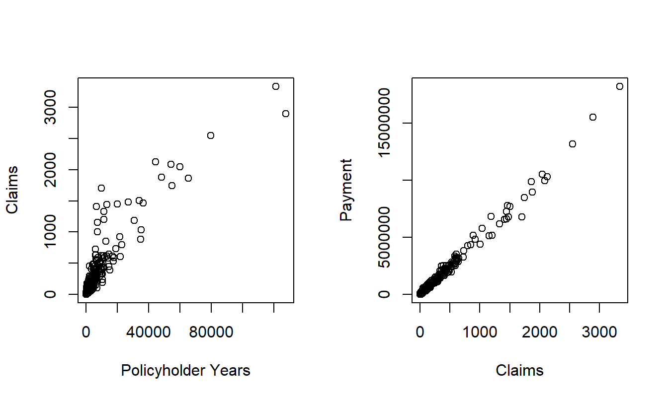
Figure 20.2: Scatter Plots of Claims versus Policyholder Years and Payments versus Claims.
R Code to Produce Figure 20.2
To understand the explanatory variable effects on frequency, Figure 20.3 presents box plots of the average claim number per insured versus each rating variable. To visualize the relationships, three combinations where the average claim exceeds 1.0 have been omitted. This figure shows lower frequencies associated with lower driving distances, non-urban locations and higher number of accident free years. The automobile type also appears to have a strong impact on claim frequency.
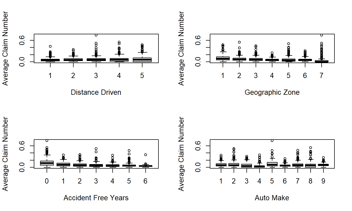
Figure 20.3: Box Plots of Frequency by Distance Driven, Geographic Zone, Accident Free Years and Make of Automobile
R Code to Produce Figure 20.3
For severity, Figure 20.4 presents box plots of the average payment per claim versus each rating variable. Here, effects of the explanatory variables are not as pronounced as with frequency. The upper right hand panel shows that the average severity is much smaller for Zone=7. This corresponds to Gotland, a county and municipality of Sweden that occupies the largest island in the Baltic Sea. Figure 20.4 also suggests some variation based on the type of automobile.
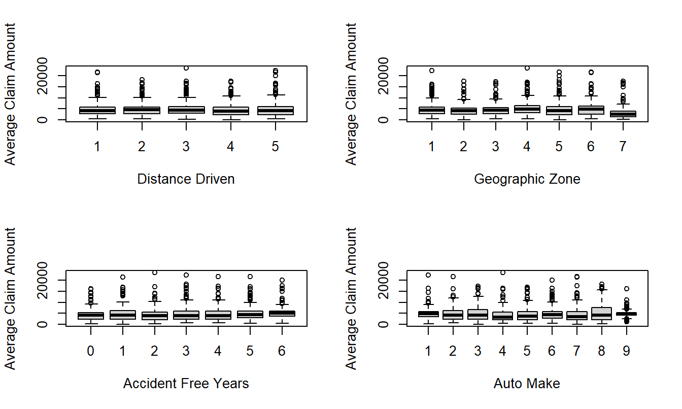
Figure 20.4: Box Plots of Severity by Distance Driven, Geographic Zone, Accident Free Years and Make of Automobile
R Code to Produce Figure 20.4
Section 3. Model Selection and Interpretation
Section 2 established that there are real patterns between claims frequency and severity and the rating variables, despite the great variability in these variables. This section summarizes these patterns using regression modeling. Following the statement of the model and its interpretation, this section describes features of the data that drove the selection of the recommended model.
As a result of this study, I recommend a Poisson regression model using a logarithmic link function for the frequency portion. The systematic component includes the rating factors distance, zone, experience and type as additive categorical variables as well as an offset term in logarithmic number of insureds.
This model was fit using maximum likelihood, with the coefficients appearing in Table 20.3; more details appear in Appendix A4. Here, the base categories correspond to the first level of each factor. To illustrate, consider a driver living in Stockholm (Zone=1) who drives between one and fifteen thousand kilometers per year (Kilometres=2), has had an accident within the last year (Bonus=1) and driving car type “Make=6”. Then, from Table 20.3, the systematic component is \(-1.813 + 0.213 -0.336 = -1.936.\) For a typical policy from this combination, we would estimate a Poisson number of claims with mean \(\exp(-1.936) = 0.144.\) For example, the probability of no claims within a year is \(\exp(-0.144) = 0.866.\) In 1977, there were 354.4 policyholder years in this combination, for an expected number of claims of \(354.4 \times 0.144 = 51.03.\) It turned out that there were only 48 claims in this combination in 1977.
Table 20.3. Poisson Regression Model Fit
\[ \small{ \begin{array}{lrrlrr} \hline \text{Variable} & \text{Coefficient} & t-\text{ratio} & \text{Variable} & \text{Coefficient} & t-\text{ratio} \\ \hline \text{Intercept} & -1.813 & -131.78 & \text{Bonus}=2 & -0.479 & -39.61 \\ \text{Kilometres}=2 & 0.213 & 28.25 & \text{Bonus}=3 & -0.693 & -51.32 \\ \text{Kilometres}=3 & 0.320 & 36.97 & \text{Bonus}=4 & -0.827 & -56.73 \\ \text{Kilometres}=4 & 0.405 & 33.57 & \text{Bonus}=5 & -0.926 & -66.27 \\ \text{Kilometres}=5 & 0.576 & 44.89 & \text{Bonus}=6 & -0.993 & -85.43 \\ \text{Zone}=2 & -0.238 & -25.08 & \text{Bonus}=7 & -1.327 & -152.84 \\ \text{Zone}=3 & -0.386 & -39.96 & \text{Make}=2 & 0.076 & 3.59 \\ \text{Zone}=4 & -0.582 & -67.24 & \text{Make}=3 & -0.247 & -9.86 \\ \text{Zone}=5 & -0.326 & -22.45 & \text{Make}=4 & -0.654 & -27.02 \\ \text{Zone}=6 & -0.526 & -44.31 & \text{Make}=5 & 0.155 & 7.66 \\ \text{Zone}=7 & -0.731 & -17.96 & \text{Make}=6 & -0.336 & -19.31 \\ & & & \text{Make}=7 & -0.056 & -2.40 \\ & & & \text{Make}=8 & -0.044 & -1.39 \\ & & & \text{Make}=9 & -0.068 & -6.84 \\ \hline \end{array} } \]
R Code to Produce Table 20.3
For the severity portion, I recommend a gamma regression model using a logarithmic link function. The systematic component consists of the rating factors zone and type as additive categorical variables as well as an offset term in logarithmic number of claims. Further, the square root of the claims number was used as a weighting variable to give larger weight to those combinations with greater number of claims.
This model was fit using maximum likelihood, with the coefficients appearing in Table 20.4; more details appear in Appendix A6. Consider again our illustrative driver living in Stockholm (Zone=1) who drives between one and fifteen thousand kilometers per year (=2), has had an accident within the last year (Bonus=1) and driving car type “Make=6”. For this person, the systematic component is \(8.388 + 0.108 = 8.496.\) Thus, the expected claims under the model are \(\exp(8.496) = 4,895.\) For comparison, the average 1977 payment was 3,467 for this combination and 4,955 per claim for all combinations.
Table 20.4. Gamma Regression Model Fit
\[ \small{ \begin{array}{lrrlrr} \hline \text{Variable} & \text{Coefficient} & t-\text{ratio} & \text{Variable} & \text{Coefficient} & t-\text{ratio} \\ \hline Intercept & 8.388 & 76.72 & \text{Make}=2 & -0.050 & -0.44 \\ \text{Zone}=2 & -0.061 & -0.64 & \text{Make}=3 & 0.253 & 2.22 \\ \text{Zone}=3 & 0.153 & 1.60 & \text{Make}=4 & 0.049 & 0.43 \\ \text{Zone}=4 & 0.092 & 0.94 & \text{Make}=5 & 0.097 & 0.85 \\ \text{Zone}=5 & 0.197 & 2.12 & \text{Make}=6 & 0.108 & 0.92 \\ \text{Zone}=6 & 0.242 & 2.58 & \text{Make}=7 & -0.020 & -0.18 \\ \text{Zone}=7 & 0.106 & 0.98 & \text{Make}=8 & 0.326 & 2.90 \\ & & & \text{Make}=9 & -0.064 & -0.42 \\ Dispersion & 0.483 \\ \hline \end{array} } \]
R Code to Produce Table 20.4
Discussion of the Frequency Model
Both models provided a reasonable fit to the available data. For the frequency portion, the \(t\)-ratios in Table 20.3 associated with each coefficient exceed three in absolute value, indicating strong statistical significance. Moreover, Appendix A5 demonstrates that each categorical factor is strongly statistically significant.
There were no other major patterns between the residuals from the final fitted model and the explanatory variables. Figure A1 displays a histogram of the deviance residuals, indicating approximate normality, a sign that the data are in congruence with model assumptions.
A number of competing frequency models were considered. Table 20.5 lists two others, a Poisson model without covariates and a negative binomial model with the same covariates as the recommended Poisson model. This table shows that the recommended model is best among these three alternatives, based on the Pearson goodness of fit statistic and a version weighted by exposure. Recall that the Pearson fit statistic is of the form \(\sum (O-E)^2/E\), comparing observed (\(O\)) to data expected under the model fit (\(E\)). The weighted version summarizes \(\sum w(O-E)^2/E\), where our weights are policyholder years in units of 100,000. In each case, we prefer models with smaller statistics. Table 20.5 shows that the recommended model is the clear choice among the three competitors.
Table 20.5. Pearson Goodness of Fit for Three Frequency Models
\[ \small{ \begin{array}{lrr} \hline \text{Model} & \text{Pearson} & \text{Weighted Pearson} \\ \hline \text{Poisson without Covariates} & 44,639 &653.49 \\ \text{Final Poisson Model}& 3,003 & 6.41\\ \text{Negative Binomial Model}& 3,077 & 9.03\\ \hline \end{array} } \]
R Code to Produce Table 20.5
In developing the final model, the first decision made was to use the Poisson distribution for counts. This is in accord with accepted practice and because a histogram of claims numbers (not displayed here) showed a skewed Poisson-like distribution.
Covariates displayed important features that could affect the frequency, as shown in Section 2 and Appendix A3.
In addition to the Poisson and negative binomial models, I also fit a quasi-Poisson model with an extra parameter for dispersion. Although this seemed to be useful, ultimately I chose not to recommend this variation because the ratemaking goal is to fit expected values. All rating factors were very statistically significant with and without the extra dispersion factor and so the extra parameter added only complexity to the model. Hence, I elected not to include this term.
Discussion of the Severity Model
For the severity model, the categorical factors zone and make are statistically significant, as shown in Appendix A7. Although not displayed here, residuals from this model were well-behaved. Deviance residuals were approximately normally distributed. Residuals, when rescaled by the square root of the claims number were approximately homoscedastic. There were no apparent relations with explanatory variables.
This complex model was specified after a long examination of the data. Based on the evident relations between payments and number of claims in Figure 20.2, the first step was to examine the distribution of payments per claim. This distribution was skewed and so an attempt to fit logarithmic payments per claim was made. After fitting explanatory variables to this dependent variable, residuals from the model fitting were heteroscedastic. These were weighted by the square root of the claims number and achieved approximate homoscedasticity. Unfortunately, as seen in Appendix Figure A2, the fit is still poor in the lower tails of the distribution.
A similar process was then undertaken using the gamma distribution with a log-link function, with payments as the response and logarithmic claims number as the offset. Again, I established the need for the square root of the claims number as a weighting factor. The process began with all four explanatory variables but distance and accident free years were dropped due to their lack of statistical significance. I also created a binary variable “Safe” to indicate that a driver had six or more accident free years (based on my examination of Figure 20.4). However, this turned out to be not statistically significant and so was not included in the final model specification.
Section 4. Summary and Concluding Remarks
Although insurance claims vary significantly, we have seen that it is possible to establish important determinants of claims number and payments. The recommended regression models conclude that insurance outcomes can be explained in terms of the distance driven by a vehicle, geographic area, recent driver claims experience and type of automobile. Separate models were developed for the frequency and severity of claims. It part, this was motivated by the evidence that fewer variables seem to influence payment amounts compared to claims number.
This study was based on 113,171 claims from 2,383,170 policyholder years, for a total of 560,790,681 kroners. This is a large data set that allows us to develop complex statistical models. The grouped form of the data allows us to work with only \(n=2,182\) cells, relatively small by today’s standards. Ungrouped data would have the advantage of allowing us to consider additional explanatory variables. One might conjecture about any number of additional variables that could be included; age, gender and good student discount are some good candidates. I note that the article by Hallin and Ingenbleek (1983) considered vehicle age - this variable was not included in my database because analysts responsible for the data publication considered it to be an insignificant determinant of insurance claims.
Further, my analysis of data is based on 1977 experience of Swedish drivers. The lessons learned from this report may or may not transfer to modern drivers that are closer. Nonetheless, the techniques explored in this report should be immediately applicable with the appropriate set of modern experience.
Appendix
Appendix Table of Contents
- References
- Variable Definitions
- Basic Summary Statistics for Frequency
- Final Fitted Frequency Regression Model—R Output
- Checking Significance of Factors in the Final Fitted Frequency Regression Model — R Output
- Final Fitted Severity Regression Model—R Output
- Checking Significance of Factors in the Final Fitted Severity Regression Model — R Output
A1. References
- Andrews, D. F. and A. M. Herzberg (1985). Chapter 68 in: A Collection from Many Fields for the Student and Research Worker, pp. 413-421. Springer, New York.
- Hallin, Marc and Jean-Franois Ingenbleek (1983). The Swedish automobile portfolio in 1977: A statistical study. Scandinavian Actuarial Journal 1983: 49-64.
A2. Variable Definitions
TABLE A.1. Variable Definitions \[ \small{ \begin{array}{ll} \hline \text{Name} &\text{Description} \\ \hline \text{Kilometres} & \text{Kilometers traveled per year} \\ & 1: < 1,000 \\ & 2: 1,000-15,000 \\ & 3: 15,000-20,000 \\ & 4: 20,000-25,000 \\ & 5: > 25,000 \\ \hline \text{Zone} & \text{Geographic zone} \\ & \text{1: Stockholm, Göteborg, Malmö with surroundings} \\ & \text{2: Other large cities with surroundings} \\ & \text{3: Smaller cities with surroundings in southern Sweden} \\ & \text{4: Rural areas in southern Sweden} \\ & \text{5: Smaller cities with surroundings in northern Sweden} \\ & \text{6: Rural areas in northern Sweden} \\ & \text{7: Gotland} \\ \hline \text{Bonus} & \text{No claims bonus}. \\ & \text{Equal to the number of years, plus one, since the last claim}.\\ \text{Make} & \text{1-8 represent eight different common car models.} \\ &\text{ All other models are combined in class 9.} \\ \text{Exposure} & \text{Amount of policyholder years} \\ \text{Claims} &\text{ Number of claims} \\ \text{Payment} & \text{Total value of payments in Swedish kroner} \\ \hline \end{array} } \]
A3. Basic Summary Statistics for Frequency
TABLE A.2. Averages of Claims per Insured by Rating Factor
Kilometre
     1      2      3      4      5
0.0561 0.0651 0.0718 0.0705 0.0827

Zone
     1      2      3      4      5      6      7
0.1036 0.0795 0.0722 0.0575 0.0626 0.0569 0.0504

Bonus
     1      2      3      4      5      6      7
0.1291 0.0792 0.0676 0.0659 0.0550 0.0524 0.0364

Make
     1      2      3      4      5      6      7      8      9
0.0761 0.0802 0.0576 0.0333 0.0919 0.0543 0.0838 0.0729 0.0712
A4. Final Fitted Frequency Regression Model — R Output
Call: glm(formula = Claims ~ factor(Kilometres) + factor(Zone) +
factor(Bonus) +
    factor(Make), family = poisson(link = log), offset = log(Insured))

Deviance Residuals:
   Min      1Q  Median      3Q     Max
-6.985  -0.863  -0.172   0.600   6.401

Coefficients:
                    Estimate Std. Error z value Pr(>|z|)
(Intercept)         -1.81284    0.01376 -131.78  < 2e-16 ***
factor(Kilometres)2  0.21259    0.00752   28.25  < 2e-16 ***
factor(Kilometres)3  0.32023    0.00866   36.97  < 2e-16 ***
factor(Kilometres)4  0.40466    0.01205   33.57  < 2e-16 ***
factor(Kilometres)5  0.57595    0.01283   44.89  < 2e-16 ***
factor(Zone)2       -0.23817    0.00950  -25.08  < 2e-16 ***
factor(Zone)3       -0.38639    0.00967  -39.96  < 2e-16 ***
factor(Zone)4       -0.58190    0.00865  -67.24  < 2e-16 ***
factor(Zone)5       -0.32613    0.01453  -22.45  < 2e-16 ***
factor(Zone)6       -0.52623    0.01188  -44.31  < 2e-16 ***
factor(Zone)7       -0.73100    0.04070  -17.96  < 2e-16 ***
factor(Bonus)2      -0.47899    0.01209  -39.61  < 2e-16 ***
factor(Bonus)3      -0.69317    0.01351  -51.32  < 2e-16 ***
factor(Bonus)4      -0.82740    0.01458  -56.73  < 2e-16 ***
factor(Bonus)5      -0.92563    0.01397  -66.27  < 2e-16 ***
factor(Bonus)6      -0.99346    0.01163  -85.43  < 2e-16 ***
factor(Bonus)7      -1.32741    0.00868 -152.84  < 2e-16 ***
factor(Make)2        0.07624    0.02124    3.59  0.00033 ***
factor(Make)3       -0.24741    0.02509   -9.86  < 2e-16 ***
factor(Make)4       -0.65352    0.02419  -27.02  < 2e-16 ***
factor(Make)5        0.15492    0.02023    7.66  1.9e-14 ***
factor(Make)6       -0.33558    0.01738  -19.31  < 2e-16 ***
factor(Make)7       -0.05594    0.02334   -2.40  0.01655 *
factor(Make)8       -0.04393    0.03160   -1.39  0.16449
factor(Make)9       -0.06805    0.00996   -6.84  8.2e-12 ***
---
Signif. codes:  0  ***  0.001  **  0.01  *  0.05  .  0.1     1

(Dispersion parameter for poisson family taken to be 1)

    Null deviance: 34070.6  on 2181  degrees of freedom
Residual deviance:  2966.1  on 2157  degrees of freedom AIC: 10654
A5. Checking Significance of Factors in the Final Fitted Frequency Regression Model — R Output
Analysis of Deviance Table

Terms added sequentially (first to last)
                     Df Deviance Resid. Df Resid. Dev P(>|Chi|)
NULL                                  2181      34071
factor(Kilometres)    4     1476      2177      32594  2.0e-318
factor(Zone)          6     6097      2171      26498         0
factor(Bonus)         6    22041      2165       4457         0
factor(Make)          8     1491      2157       2966  1.4e-316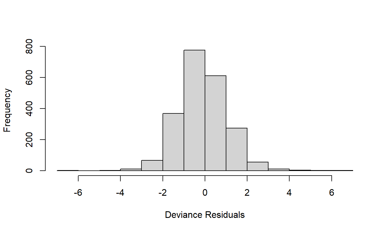
Figure 20.5: Figure A1. Histogram of deviance residuals from the final frequency model.
A6. Final Fitted Severity Regression Model — R Output
Call:
glm(formula = Payment ~ factor(Zone) + factor(Make), family = Gamma(link = log),
    weights = Weight, offset = log(Claims))

Deviance Residuals:
     Min        1Q    Median        3Q       Max
-2.56968  -0.39928  -0.06305   0.07179   2.81822

Coefficients:
              Estimate Std. Error t value Pr(>|t|)
(Intercept)    8.38767    0.10933  76.722  < 2e-16 ***
factor(Zone)2 -0.06099    0.09515  -0.641  0.52156
factor(Zone)3  0.15290    0.09573   1.597  0.11041
factor(Zone)4  0.09223    0.09781   0.943  0.34583
factor(Zone)5  0.19729    0.09313   2.119  0.03427 *
factor(Zone)6  0.24205    0.09377   2.581  0.00992 **
factor(Zone)7  0.10566    0.10804   0.978  0.32825
factor(Make)2 -0.04963    0.11306  -0.439  0.66071
factor(Make)3  0.25309    0.11404   2.219  0.02660 *
factor(Make)4  0.04948    0.11634   0.425  0.67067
factor(Make)5  0.09725    0.11419   0.852  0.39454
factor(Make)6  0.10781    0.11658   0.925  0.35517
factor(Make)7 -0.02040    0.11313  -0.180  0.85692
factor(Make)8  0.32623    0.11247   2.900  0.00377 **
factor(Make)9 -0.06377    0.15061  -0.423  0.67205
---
Signif. codes:  0  ***  0.001  **  0.01  *  0.05  .  0.1     1

(Dispersion parameter for Gamma family taken to be 0.4830309)

    Null deviance: 617.32  on 1796  degrees of freedom
Residual deviance: 596.79  on 1782  degrees of freedom
AIC: 16082
A7. Checking Significance of Factors in the Final Fitted Severity Regression Model — R Output
Analysis of Deviance Table

Terms added sequentially (first to last)

               Df Deviance Resid. Df Resid. Dev P(>|Chi|)
NULL                            1796     617.32
factor(Zone)    6     8.06      1790     609.26      0.01
factor(Make)    8    12.47      1782     596.79  0.001130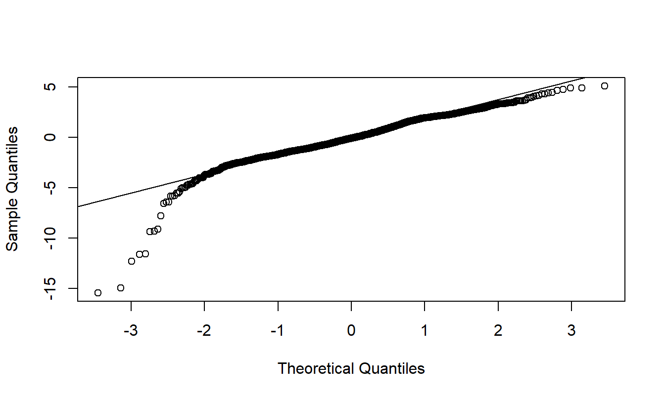
Figure 20.6: Figure A2. \(qq\) Plot of Weighted Residuals from a Lognormal Model. The dependent variable is average severity per claim. Weights are the square root of the number of claims. The poor fit in the tails suggests using an alternative to the lognormal model.
20.6 Further Reading and References
You can find further discussion of guidelines for presenting within text data in The Chicago Manual of Style, a well-known reference for preparing and editing written copy.
You can find further discussion of guidelines for presenting tabular data in Ehrenberg (1977) and Tufte (1983).
Miller (2005) is a book length introduction to writing statistical reports with an emphasis on regression methods.
Chapter References
- The Chicago Manual of Style (1993). The University of Chicago Press, 14th ed. Chicago, Ill.
- Cleveland, William S. (1994). The Elements of Graphing Data. Monterey, Calif.: Wadsworth.
- Ehrenberg, A.S.C. (1977). Rudiments of numeracy. Journal of the Royal Statistical Society A 140:277-97.
- Miller, Jane E. (2005). The Chicago Guide to Writing about Multivariate Analysis. The University of Chicago Press, Chicago, Ill.
- Tufte, Edward R. (1983). The Visual Display of Quantitative Information. Graphics Press, Cheshire, Connecticut.
- Tufte, Edward R. (1990). Envisioning Information. Graphics Press, Cheshire, Connecticut.
20.7 Exercise
20.1. Determinants of CEO Compensation. Chief executive officer (CEO) compensation varies significantly from firm to firm. For this exercise, you will report on a sample of firms from a survey by Forbes Magazine to establish important patterns in the compensation of CEOs. Specifically, introduce a regression model that explains CEO salaries in terms of the firm’s sales and the CEO’s length of experience, education level and ownership stake in the firm. Among other things, this model should show that larger firms tend to pay CEOs more and, somewhat surprisingly, that CEOs with a higher educational levels earn less than otherwise comparable CEOs. In addition to establishing important influences on CEO compensation, this model should be used to predict CEO compensation for salary negotiation purposes.