Chapter 7 Modeling Trends
Chapter Preview. This chapter begins our study of time series data by introducing techniques to account for major patterns, or trends, in data that evolve over time. The focus is on how regression techniques developed in earlier chapters can be used to model trends. Further, new techniques, such as differencing data, allow us to naturally introduce a random walk, an important model of efficient financial markets.
7.1 Introduction
Time Series and Stochastic Processes
Business firms are not defined by physical structures such as the solid stone bank building that symbolizes financial security. Nor are businesses defined by space alien invader toys that they manufacture for children. Business firms are comprised of several complex, interrelated processes. A process is a series of actions or operations that lead to a particular end.
Processes are not only the building blocks of businesses, they also provide the foundations for our everyday lives. We may go to work or school every day, practice martial arts or study statistics. These are regular sequences of activities that define us. In this text, our interest is in modeling stochastic processes, defined to be ordered collections of random variables, that quantify a process of interest.
Some processes evolve over time, such as daily trips to work or school and the quarterly earnings of a firm. We use the term longitudinal data for measurements of a process that evolves over time. A single measurement of a process yields a variable over time, denoted by \(y_1,...,y_T,\) and referred to as a time series. In this portion of the text, we follow common practice and use \(T\) to denote the number of observations available (instead of \(n\)). Chapter 10 will describe another type of longitudinal data where we examine a cross-section of entities, such as firms, and examine their evolution over time. This type of data is also known as panel data.
Collections of random variables may be based on orderings other than time. For example, hurricane claim damages are recorded at the place where the damage has occurred and thus are ordered spatially. As another example, evaluation of an oil-drilling project requires taking samples of the earth at various longitudes, latitudes and depths. This yields observations ordered by the three dimensions of space but not time. As yet another example, the study of holes in the ozone layer requires taking atmospheric measurements. Because the interest is in the trend of ozone depletion, the measurements are taken at various longitudes, latitudes, heights and time. Although we consider only processes ordered by time, in other studies of longitudinal data you may see alternative orderings. Data that are not ordered are called cross-sectional.
Time Series versus Causal Models
Regression methods can be used to summarize many time series data sets. However, simply using regression techniques without establishing an appropriate context can be disastrous. This concept is reinforced by an example based on Granger and Newbold’s (1974) work.
Example: Spurious Regression. Let \(\{\varepsilon_{x,t}\}\) and \(\{\varepsilon_{y,t}\}\) be two independent sequences, each of which also has a standard normal distribution. From these, recursively construct the variables \(x_t = 0.5 + x_{t-1} + \varepsilon_{x,t}\) and \(y_t = 0.5 + y_{t-1} + \varepsilon_{y,t}\), using the initial conditions \(x_0=y_0=0\). (In Section 7.3, we will identify \(x_t\) and \(y_t\) as random walk models.) Figure 7.1 shows a realization of {\(x_t\)} and {\(y_t\)}, generated for \(T=50\) observations using simulation. The left-hand panel shows the growth of each series over time - the increasing nature is due to the addition of 0.5 at each time point. The right-hand panel shows a strong relationship between {\(x_t\)} and {\(y_t\)} - the correlation between these two series turns out to be 0.92. This is despite the fact that the two series were generated independently. Their apparent relationship, said to be spurious, is because both are related to the growth over time.
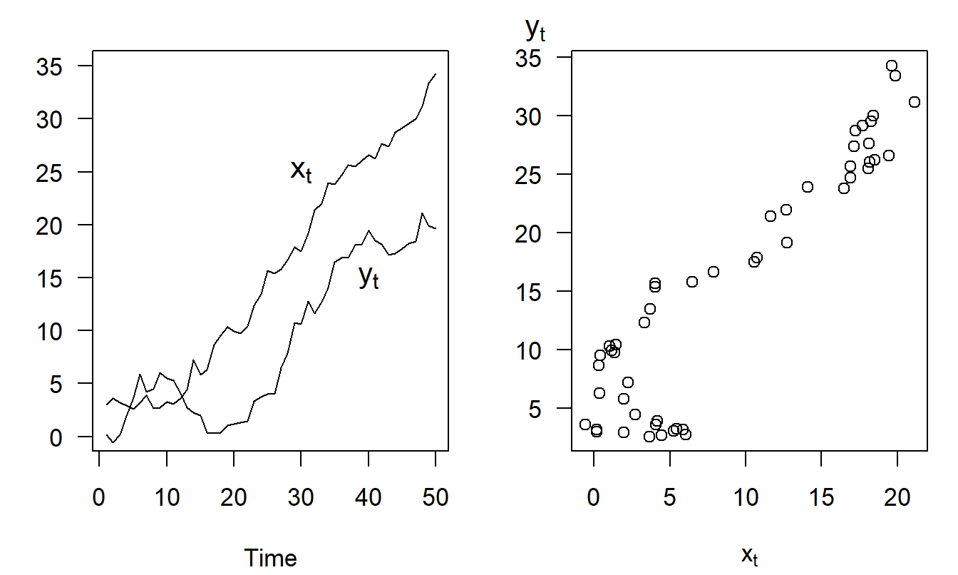
Figure 7.1: Spurious Regressions. The left-hand panel shows two time series that are increasing over time. The right-hand panel shows a scatter plot of the two series, suggesting a positive relationship between the two. The relationship is spurious in the sense that both series are driven by growth over time, not their positive dependence on one another.
In a longitudinal context, regression models of the form \[ y_t = \beta_0 + \beta_1 x_t + \varepsilon_t \] are known as causal models. Causal models are regularly employed in econometrics, where it is assumed that economic theory provides the information needed to specify the causal relationship (\(x\) “causes” \(y\)). In contrast, statistical models can only validate empirical relationships (“correlation, not causation”). In the spurious regression example, both variables evolve over time and so a model of how one variable influences another needs to account for time patterns of both the left- and right-hand side variables. Specifying causal models for actuarial applications can be difficult for this reason - time series patterns in the explanatory variables may mask or induce a significant relationship with the dependent variable. In contrast, regression modeling can be readily applied when explanatory variables are simply functions of time, the topic of the next section. This is because functions of time are deterministic and so will not exhibit time series patterns.
Causal models also suffer from the drawback that their applications are limited for forecasting purposes. This is because in order to make a forecast of a future realization of the series, for example \(y_{T+2}\), one needs to have knowledge (or a good forecast) of \(x_{T+2},\) the value of the explanatory variable at time \(T+2\). If \(x\) is a known function of time (as in the next section), then this is not an issue. Another possibility is to use a lagged value of \(x\) such as \(y_t = \beta_0 + \beta_1 x_{t-1} + \varepsilon_t,\) so that one-step predictors are possible (we can use the equation to predict \(y_{T+1}\) because \(x_T\) is known at time \(T\)).
Video: Section Summary
7.2 Fitting Trends in Time
Understanding Patterns over Time
Forecasting is about predicting future realizations of a time series. Over the years, analysts have found it convenient to decompose a series into three types of patterns: trends in time (\(T_t\)), seasonal (\(S_t\)), and random, or irregular, patterns (\(\varepsilon_t\)). A series can then be forecast by extrapolating each of the three patterns. The trend is that part of a series that corresponds to a long-term, slow evolution of the series. This is the most important part for long-range forecasts. The seasonal part of the series corresponds to aspects that repeat itself periodically, say over a year. The irregular patterns of a series are short-term movements that are typically harder to anticipate.
Analysts typically combine these patterns in two ways: in an additive fashion, \[\begin{equation} y_t = T_t + S_t + \varepsilon_t, \tag{7.1} \end{equation}\] or in a multiplicative fashion, \[\begin{equation} y_t = T_t \times S_t + \varepsilon_t. \tag{7.2} \end{equation}\] Models without seasonal components can be readily handled by using \(S_t=0\) for the additive model in equation (7.1) and \(S_t=1\) for the multiplicative model in equation (7.2). If the model is purely multiplicative such that \(y_t = T_t \times S_t \times \varepsilon_t\), then it can be converted to an additive model by taking logarithms of both sides.
It is instructive to see how these three components can be combined to form a series of interest. Consider the three components in Figure 7.2. Under the additive model, the trend, seasonal and random variation components are combined to form the series that appears in the lower right-hand panel. A plot of \(y_t\) versus \(t\) is called a time series plot. In time series plots, the convention is to connect adjacent points using a line to help us detect patterns over time.
When analyzing data, the graph in the lower right-hand panel is the first type of plot that we will examine. The goal of the analysis is to go backwards - that is, we wish to decompose the series into the three components. Each component can then be forecast which will provide us with forecasts that are reasonable and easy to interpret.
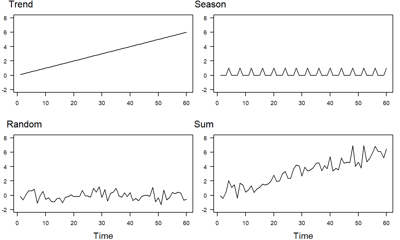
Figure 7.2: Time Series Plots of Response Components. The linear trend component appears in the upper left-hand panel, the seasonal trend in the upper right and the random variation in the lower left. The sum of the three components appears in the lower right-hand panel.
Fitting Trends in Time
The simplest type of time trend is a complete lack of trend. Assuming that the observations are identically and independently distributed (i.i.d.), then we could use the model \[ y_t = \beta_0 + \varepsilon_t. \] For example, if you are observing a game of chance such as bets placed on the roll of two dice, then we typically model this as an i.i.d. series.
Fitting polynomial functions of time is another type of trend that is easy to interpret and to fit to the data. We begin with a straight line for our polynomial function of time, yielding the linear trend in time model, \[\begin{equation} y_t = \beta_0 + \beta_1 t + \varepsilon_t. \tag{7.3} \end{equation}\] Similarly, regression techniques can be used to fit other functions that represent trends in time. Equation (7.3) is easily extended to handle a quadratic trend in time, \[ y_t = \beta_0 + \beta_1 t + \beta_2 t^2 + \varepsilon_t, \] or a higher-order polynomial.
Example: Hong Kong Exchange Rates. For travelers and firms, exchange rates are an important part of the monetary economy. The exchange rate that we consider is the number of Hong Kong dollars that one can purchase for one US dollar. We have \(T=502\) daily observations for the period April 1, 2005 through May 31, 2007 that were obtained from the Federal Reserve (H10 report). Figure 7.3 provides a time series plot of the Hong Kong exchange rate.
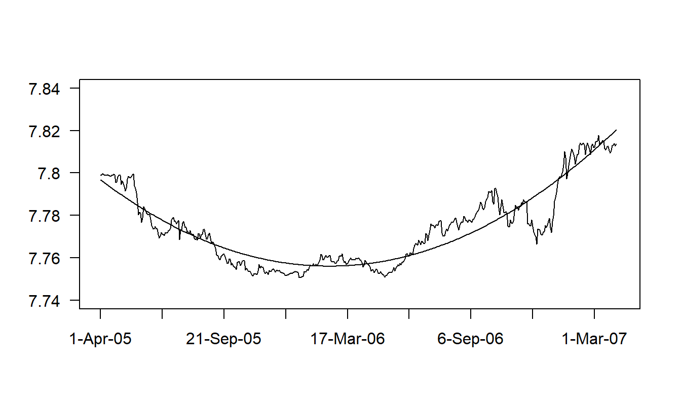
Figure 7.3: Time Series Plot of Hong Kong Exchange Rates with Fitted Values Superimposed. The fitted values are from a regression using a quadratic time trend. Source: Foreign Exchange Rates (Federal Reserve, H10 report).
R Code to Produce Figure 7.3
Figure 7.3 shows a clear quadratic trend in the data. To handle this trend, we use \(t=1,...,502\), as an explanatory variable to indicate the time period. The fitted regression equation turns out to be: \[ \begin{array}{cccc} \widehat{INDEX}_t = & 7.797 & -3.68\times 10^{-4}t & +8.269\times 10^{-7}t^2 \\ {\small t-statistics} & {\small (8,531.9)} & {\small (-44.0)} & {\small (51.2)} \end{array} . \] The coefficient of determination is a healthy \(R^2=86.2\%\) and the standard deviation estimate has dropped from \(s_{y}=0.0183\) down to \(s=0.0068\) (our residual standard deviation). Figure 7.3 shows the relationship between the data and fitted values through the time series plot of the exchange rate with the fitted values superimposed. To apply these regression results to the forecasting problem, suppose that we wanted to predict the exchange rate for April 1, 2007, or \(t=503\). Our prediction is \[ \widehat{INDEX}_{503} = 7.797 - 3.68 \times 10^{-4}(503) + 8.269 \times 10^{-7}(503)^2 = 7.8208. \]
The overall conclusion is that the regression model using a quadratic term in time \(t\) as an explanatory variable fits the data well. A close inspection of Figure 7.3, however, reveals that there are patterns in the residuals where the responses are in some places consistently higher and in other places consistently lower than the fitted values. These patterns suggest that we can improve upon the model specification. One way would be to introduce a higher order polynomial model in time. In Section 7.3, we will argue that the random walk is an even better model for this data.
Other nonlinear functions of time may also be useful. To illustrate, we might study some measure of interest rates over time (\(y_t\)) and be interested in the effect of a change in the economy (such as the advent of a war). Define \(z_t\) to be a binary variable that is zero before the change occurs and is one during and after the change. Consider the model, \[\begin{equation} y_t = \beta_0 + \beta_1 z_t + \varepsilon_t. \tag{7.4} \end{equation}\] Thus, using \[ \mathrm{E~}y_t = \left\{ \begin{array}{ll} \beta_0 + \beta_1 & \text{if }z_t=1 \\ \beta_0 & \text{if }z_t = 0 \end{array} \right. , \] the parameter \(\beta_1\) captures the expected change in interest rates due to the change in the economy. See Figure 7.4.
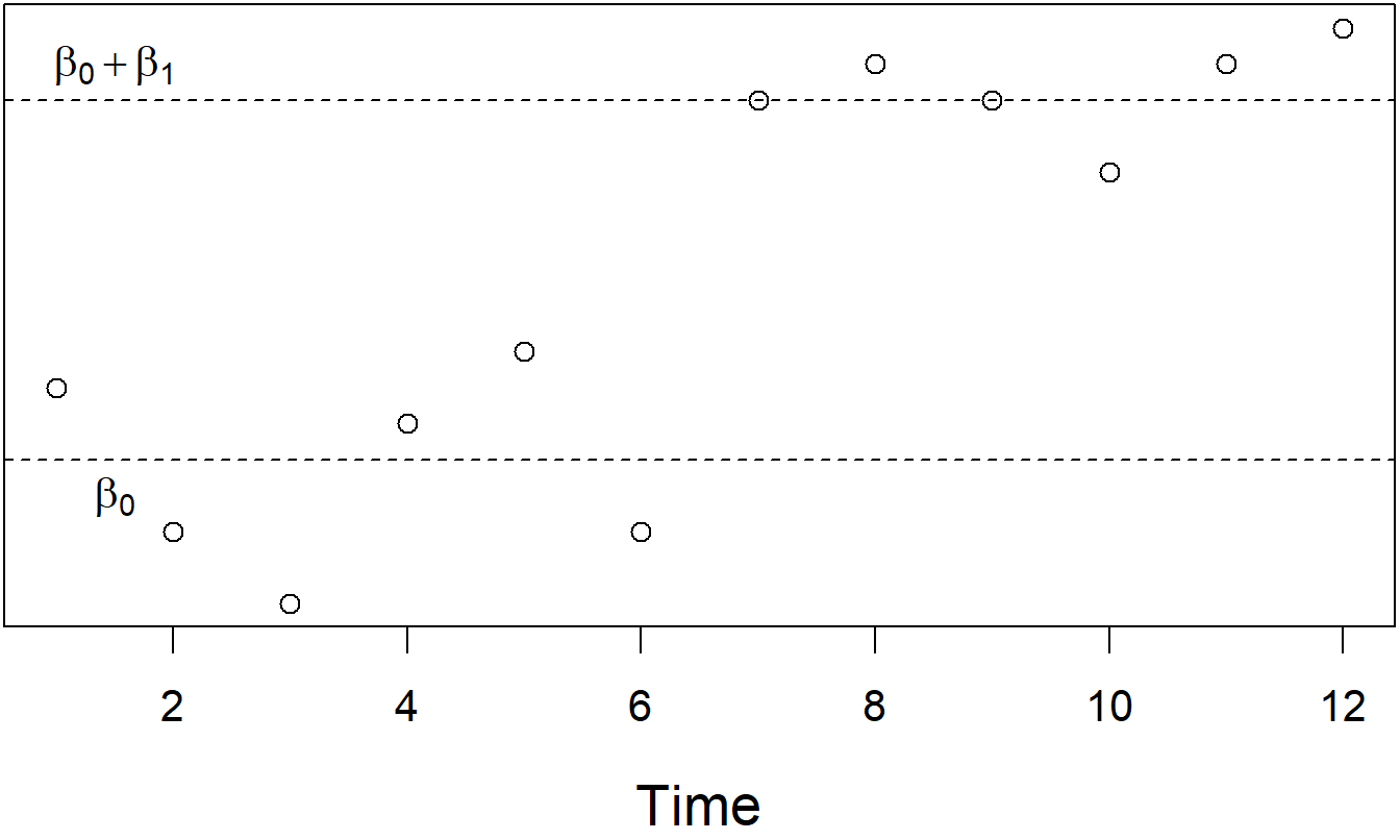
Figure 7.4: Time Series Plot of Interest Rates. There is a clear shift in the rates due to a change in the economy. This shift can be measured using a regression model with an explanatory variable to indicate the change.
Example: Regime-Switching Models of Long-Term Stock Returns. With the assumption of normality, we can write the model in equation (7.4) as \[ y_t \sim \left\{ \begin{array}{ll} N(\mu_1, \sigma^2) & t < t_0 \\ N(\mu_2, \sigma^2)& t \geq t_0 \end{array} \right. , \] where \(\mu_1 = \beta_0\), \(\mu_2 = \beta_0 + \beta_1\) and \(t_0\) is the change point. A regime-switching model generalizes this concept, primarily by assuming that the change point is not known. Instead, one assumes there exists a transition mechanism that allows us to shift from one “regime” to another with a probability that is typically estimated from the data. In this model, there is a finite number of states, or “regimes.” Within each regime, a probabilistic model is specified, such as the (conditionally) independent normal distribution (\(N(\mu_2, \sigma^2)\)). One could also specify an autoregressive or conditionally autoregressive model that we will define in Chapter 8. Further, there is a conditional probability of transiting from one state to another (so-called “Markov” transition probabilities).
Hardy (2001) introduced regime-switching models to the actuarial literature where the dependent variable of interest was the long-term stock market return as measured by monthly returns on (1) the Standard and Poor’s 500 and the Toronto Stock Exchange 300. Hardy considered two and three regime models for data over 1956 to 1999, inclusive. Hardy showed how to use the parameter estimates from the regime-switching model to compute option prices and risk measures for equity-linked insurance contracts.
Fitting Seasonal Trends
Regular periodic behavior is often found in business and economic data. Because such periodicity is often tied to the climate, these trends are called seasonal components. Seasonal trends can be modeled using the same techniques as with regular, or aperiodic, trends. The following example shows how to capture periodic behavior using seasonal binary variables.
Example: Trends in Voting. On any given election day, the number of voters that actually turn out to voting booths depend on a number of factors: the publicity that an election race has received, the issues that are debated as part of the race, other issues facing voters on election day, and nonpolitical factors, such as the weather. Now, potential political candidates base their projections of campaign financing, and chances of winning an election, on forecasts of the number of voters who will actually participate in an election. Decisions as to whether or not to participate as a candidate must be made well in advance; generally, so far in advance that well-known factors such as the weather on election day can not be used in generating forecasts.
We consider here the number of Wisconsin voters who participated in statewide elections over the period 1920 through 1990. Although the interest is in forecasting the actual number of voters, we consider voters as a percentage of the qualified voting public. Dividing by the qualified voting public controls for the size of the population of voters; this enhances comparability between the early and latter parts of the series. Because mortality trends are relatively stable, reliable projections of the qualified voting public can be readily attained. Forecasts of the percentage may then be multiplied by projections of the voting public to obtain forecasts of the actual voter turnout.
To specify a model, we examine Figure 7.5, a time series plot of the voter turnout as a percent of the qualified voting public. This figure displays the low voter turnout in the early part of the series, followed by larger turnout in the 1950’s and 1960’s, followed by a smaller turnout in the 1980’s. This pattern can be modeled using, for example, a quadratic trend in time. The figure also displays a much larger turnout in presidential elections years. This periodic, or seasonal, component can be modeled using a binary variable. A candidate model is \[ y_t=\beta_0+\beta_1t+\beta_2t^2+\beta_{3}z_t+\varepsilon _t, \] where
\[ z_t=\left\{ \begin{array}{ll} 1 & \text{if presidential election year} \\ 0 & \text{otherwise} \end{array} \right. . \] Here, \(\beta_{3}z_t\) captures the seasonal component in this model.
Regression was used to fit the model. The fitted model provided a good fit of the data - the coefficient of determination from the fit was \(R^2=89.6\%.\) Figure 7.5 shows a strong relationship between the fitted and actual values.
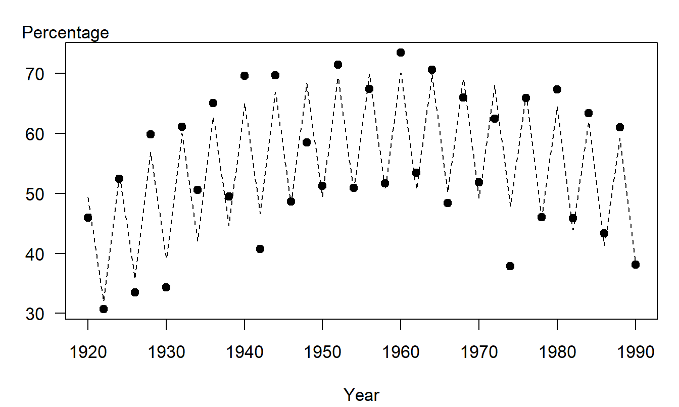
Figure 7.5: Wisconsin Voters as a Percentage of the Qualified Voting Public, by Year. The opaque circles represent the actual voting percentages. The dashed lines represent the fitted trend, using a quadratic trend in time plus a binary variable to indicate a presidential election year.
The voting trend example demonstrates the use of binary variables to capture seasonal components. Similarly, seasonal effects may be also be represented using categorical variables, such as \[ z_t=\left\{ \begin{array}{ll} 1 & \text{if spring} \\ 2 & \text{if summer} \\ 3 & \text{if fall} \\ 4 & \text{if winter}. \end{array} \right. \]
Another way of capturing seasonal effects is through the use of trigonometric functions. Further discussion of the use of trigonometric functions to handle seasonal components is in Section 9.3.
Removal of seasonal patterns is known as seasonal adjustment. This strategy is appropriate in public policy situations where interest centers on interpreting the resulting “seasonally adjusted series.” For example, government agencies typically report industrial manufacturing revenues in terms of seasonally adjusted numbers, with the understanding that known holiday and weather related patterns are accounted for when reporting growth. However, for most actuarial and risk management applications, the interest is typically in forecasting the variation of the entire series, not just the seasonally adjusted portion.
Reliability of Time Series Forecasts
Time series forecasts are sometimes called “naive” forecasts. The adjective “naive” is somewhat ironic because many time series forecasting techniques are technical in nature and complex to compute. However, these forecasts are based on extrapolating a single series of observations. Thus, they are naive in the sense that the forecasts ignore other sources of information that may be available to the forecaster and users of the forecasts. Despite ignoring this possibly important information, time series forecasts are useful in that they provide an objective benchmark that other forecasts and expert opinions can be compared against.
Projections should provide a user with a sense of the reliability of the forecast. One way of quantifying this is to provide forecasts under “low-intermediate-high” sets of assumptions. For example, if we are forecasting the national debt, we might do so under three scenarios of the future performance of the economy. Alternatively, we can calculate prediction intervals using many of the models for forecasting that are discussed in this text. Prediction intervals provide a measure of reliability that can be interpreted in a familiar probabilistic sense. Further, by varying the desired level of confidence, the prediction intervals vary, thus allowing us to respond to “what if” types of questions.
For example, in Figure 21.10 you will find a comparison of “low-intermediate-high” projections to prediction intervals for forecasts of the inflation rate (CPI) used in projecting Social Security funds. The low-intermediate-high projections are based on a range of expert opinions and thus reflect variability of the forecasters. The prediction intervals reflect innovation uncertainty in the model (assuming that the model is correct). Both ranges give the user a sense of reliability of the forecasts although in different ways.
Prediction intervals have the additional advantage in that they quantify the fact that forecasts become less reliable the further that we forecast into the future. Even with cross-sectional data, we saw that the farther away we were from the main part of the data, the less confident we felt in our predictions. This is also true in forecasting for longitudinal data. It is important to communicate this to consumers of forecasts, and prediction intervals are a convenient way of doing so.
In summary, regression analysis using various functions of time as explanatory variables is a simple yet powerful tool for forecasting longitudinal data. It does, however, have drawbacks. Because we are fitting a curve to the entire data set, there is no guarantee that the fit for the most recent part of the data will be adequate. That is, for forecasting, the primary concern is for the most recent part of the series. We know that regression analysis estimates give the most weight to observations with unusually large explanatory variable values. To illustrate, using a linear trend in time model, this means giving the most weight to observations at the end and at the beginning of the series. Using a model that gives large weight to observations at the beginning of the series is viewed with suspicion by forecasters. This drawback of regression analysis motivates us to introduce additional forecasting tools. (Section 9.1 develops this point further.)
Video: Section Summary
7.3 Stationarity and Random Walk Models
A basic concern with processes that evolve over time is the stability of the process. For example: “Is it taking me longer to get to work since they put in the new stop light?” “Have quarterly earnings improved since the new CEO took over?” We measure processes to improve or manage their performance and to forecast the future of the process. Because stability is a fundamental concern, we will work with a special kind of stability called stationarity.
Definition. Stationarity is the formal mathematical concept corresponding to the “stability” of a time series of data. A series is said to be (weakly) stationary if
- the mean \(\mathrm{E~}y_t\) does not depend on \(t\) and
- the covariance between \(y_{s}\) and \(y_t\) depends only on the difference between time units, \(|t-s|.\)
Thus, for example, under weak stationarity \(\mathrm{E~}y_{4}=\mathrm{E~} y_{8}\) because the means do not depend on time and thus are equal. Further, \(\mathrm{Cov}(y_{4},y_{6})=\mathrm{Cov}(y_{6},y_{8})\), because \(y_{4}\) and \(y_{6}\) are two time units apart, as are \(y_{6}\) and \(y_{8}\). As another implication of the second condition, note that \(\sigma^2 = \mathrm{Cov}(y_t, y_t) = \mathrm{Cov}(y_s, y_s) = \sigma^2\). Thus, a weakly stationary series has a constant mean as well as a constant variance (homoscedastic). Another type of stationarity known as strict, or strong, stationarity requires that the entire distribution of \(y_t\) be constant over time, not just the mean and the variance.
White Noise
The link between longitudinal and cross-sectional models can be established through the notion of a white noise process. A white noise process is a stationary process that displays no apparent patterns through time. More formally, a white noise process is simply a series that is i.i.d., identically and independently distributed. A white noise process is only one type of stationary process - Chapter 8 will introduce another type, an autoregressive model.
A special feature of the white noise process is that forecasts do not depend on how far into the future that we wish to forecast. Suppose that a series of observations, \(y_1,...,y_T\), has been identified as a white noise process. Let \(\overline{y}\) and \(s_y\) denote the sample average and standard deviation, respectively. A forecast of an observation in the future, say \(y_{T+l}\), for \(l\) lead time units in the future, is \(\overline{y}\). Further, a forecast interval is \[\begin{equation} \overline{y}\pm \ t_{T-1,1-\alpha/2} ~ s_y \sqrt{1+\frac{1}{T}}. \tag{7.5} \end{equation}\] In time series applications, because the sample size \(T\) is typically relatively large, we use the approximate 95% prediction interval \(\overline{y} \pm 2 s_y\). This approximate forecast interval ignores the parameter uncertainty in using \(\overline{y}\) and \(s_y\) to estimate the mean \(\mathrm{E}~y\) and standard deviation \(\sigma\) of the series. Instead, it emphasizes the uncertainty in future realizations of the series (known as innovation uncertainty). Note that this interval does not depend on the choice of \(l\), the number of lead units that we forecast into the future.
The white noise model is both the least and the most important of time series models. It is the least important in the sense that the model assumes that the observations are unrelated to one another, an unlikely event for most series of interest. It is the most important because our modeling efforts are directed towards reducing a series to a white noise process. In time series analysis, the procedure for reducing a series to a white noise process is called a filter. After all patterns have been filtered from the data, the uncertainty is said to be irreducible.
Random Walk
We now introduce the random walk model. For this time series model, we will show how to filter the data simply by taking differences.
To illustrate, suppose that you play a simple game based on the roll of the two dice. To play the game, you must pay $7 each time you roll the dice. You receive the number of dollars corresponding the sum of the two dice, \(c_t^{\ast}\). Let \(c_t\) denote your winnings on each roll, so that \(c_t = c_t^{\ast} - 7\). Assuming that the rolls are independent and come from the same distribution, the series \(\{c_t\}\) is a white noise process.
Assume that you start with initial capital of \(y_0 = \$100\). Let \(y_t\) denote the sum of capital after the \(t\)th roll. Note that \(y_t\) is determined recursively by \(y_t = y_{t-1} + c_t\). For example, because you won $3 on the first roll, \(t=1\), you now have capital \(y_1 = y_0 + c_1\), or 103 = 100 + 3. Table 7.1 shows the results for the first five throws. Figure 7.6 is a time series plot of the sums, \(y_t\), for the fifty throws.
Table 7.1. Winnings for Five of the 50 Rolls
\[ \begin{array}{c|ccccc} \hline t & 1 & 2 & 3 & 4 & 5 \\ c_t^{\ast } & 10 & 9 & 7 & 5 & 7 \\ c_t & 3 & 2 & 0 & -2 & 0 \\ ~~y_t~~ & ~103~ & ~105~ & ~105~ & ~103~ & 103 \\ \hline \end{array} \]
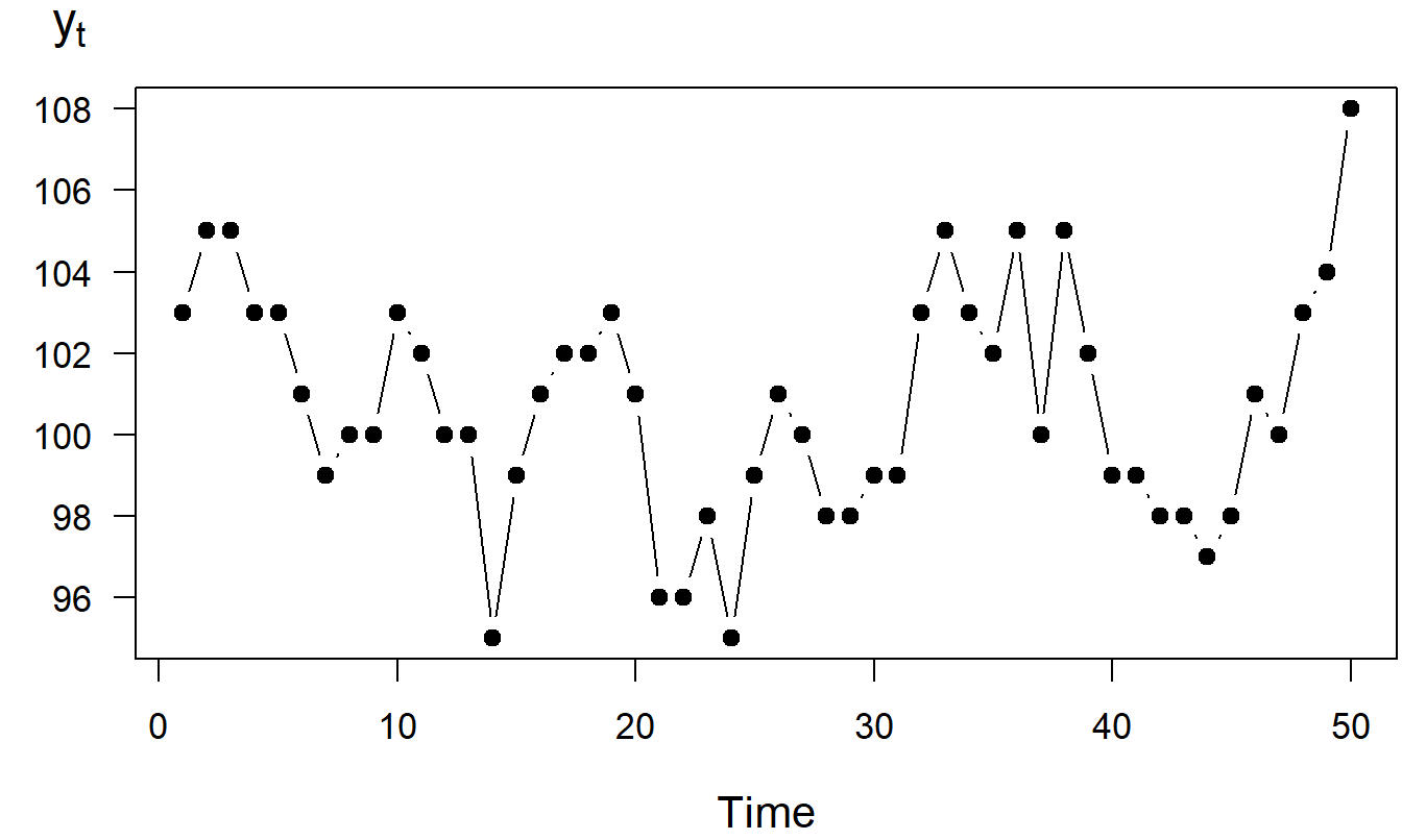
Figure 7.6: Time Series Plot of the Sum of Capital
The partial sums of a white noise process define a random walk model. For example, the series \(\{y_1, \ldots ,y_{50}\}\) in Figure 7.6 is a realization of the random walk model. The phrase partial sum is used because each observation, \(y_t\), was created by summing the winnings up to time \(t\). For this example, winnings, \(c_t\), are a white noise process because the amount returned, \(c_t^{\ast}\), is i.i.d. In our example, your winnings from each roll of the dice is represented using a white noise process. Whether you win on one roll of the dice has no influence on the outcome of the next, or previous, roll of the dice. In contrast, your amount of capital at any roll of the dice is highly related to the amount of capital after the next roll, or previous roll. Your amount of capital after each roll of the dice is represented by a random walk model.
Video: Section Summary
7.4 Inference using Random Walk Models
The random walk is a commonly used time series model. To see how it can be applied, we first discuss a few model properties. These properties are then used to forecast and identify a series as a random walk. Finally, this section compares the random walk to a competitor, the linear trend in time model.
Model Properties
To state the properties of the random walk, we first recap some definitions. Let \(c_1,\ldots ,c_T\) be \(T\) observations from a white noise process. A random walk can be expressed recursively as \[\begin{equation} y_t = y_{t-1} + c_t. \tag{7.6} \end{equation}\] By repeated substitution, we have \[ y_t = c_t + y_{t-1} = c_t + \left( c_{t-1} + y_{t-2}\right) = \ldots \] If we use \(y_0\) to be the initial level, then we can express the random walk as \[\begin{equation} y_t = y_0 + c_1 + \ldots + c_t. \tag{7.7} \end{equation}\] Equation (7.7) shows that a random walk is the partial sum of a white noise process.
The random walk is not a stationary process because the variability, and possibly the mean, depends on the time point at which the series is observed. Taking the expectation and variance of equation (7.7) yields the mean level and variability of the random walk process: \[ \mathrm{E~}y_t = y_0 + t\mu_c\ \ \text{ and} \ \ \mathrm{Var~} y_t = t \sigma_c^2, \] where \(\mathrm{E~}c_t = \mu_c\) and \(\mathrm{Var~}c_t = \sigma _c^2\). Hence, as long as there is some variability in the white noise process (\(\sigma_c^2 > 0\)), the random walk is nonstationary in the variance. Further, if \(\mu_c\neq 0\), then the random walk is nonstationary in the mean.
Forecasting
How can we forecast a series of observations, \(y_1,...,y_T\), that has been identified as a realization of a random walk model? The technique we use is to forecast the differences, or changes, in the series and then sum the forecast differences to get the forecast series. This technique is tractable because, by the definition of a random walk model, the differences can be represented using a white noise process, a process that we know how to forecast.
Consider \(y_{T+l}\), the value of the series \(l\) lead time units into the future. Let \(c_t=y_t-y_{t-1}\) represent the differences in the series, so that \[\begin{eqnarray*} y_{T+l} &=&y_{T+l-1}+c_{T+l} = \left( y_{T+l-2} + c_{T+l-1}\right) +c_{T+l} = \ldots \\ &=&y_T+c_{T+1}+ \ldots +c_{T+l}. \end{eqnarray*}\] We interpret \(y_{T+l}\) to be the current value of the series, \(y_T\), plus the partial sum of future differences.
To forecast \(y_{T+l}\), because at time \(T\) we know \(y_T\), we need
only forecast the changes \(\{c_{T+1}, \ldots, c_{T+l}\}\). Because a
forecast of a future value of a white noise process is just the
average of the process, the forecast of \(c_{T+k}\) is \(\overline{c}\)
for \(k=1,2,\ldots,l\). Putting these together, the forecast of
\(y_{T+l}\) is \(y_T+l\overline{c}\) . For example, for \(l=1\), we
interpret the forecast of the next value of the series to be the
current value of the series plus the average change of the series.
Using similar ideas, we have that an approximate 95% prediction interval for \(y_{T+l}\) is \[ y_T+l\overline{c}\pm 2s_c\sqrt{l} \] where \(s_c\) is the standard deviation computed using the changes \(c_2,c_{3},\ldots,c_T\). Note that the width of the prediction interval, \(4 s_c \sqrt{l}\), grows as the lead time \(l\) grows. This increasing width simply reflects our diminishing ability to predict into the future.
As an example, we rolled the dice \(T=50\) times and that we would like to forecast \(y_{60}\), our sum of capital after 60 rolls. At time 50, it turned out that our sum of money available was \(y_{50}=\$93\). Starting with \(y_0 = \$100\), the average change was \(\overline{c} = -7/50 = -0.14\), with standard deviation \(s_c=\$2.703\). Thus, the forecast at time 60 is \(93+10(-.14) =91.6\). The corresponding 95% prediction interval is \[ 91.6\pm 2\left( 2.703\right) \sqrt{10}=91.6\pm 17.1=\left( 74.5,108.7\right) . \]
Example: Labor Force Participation Rates. Labor force participation rate (\(LFPR\)) forecasts, coupled with forecasts of the population, provide us with a picture of a nation’s future workforce. This picture provides insights to the future workings of the overall economy, and thus \(LFPR\) projections are of interest to a number of government agencies. In the United States, \(LFPR\)s are projected by the Social Security Administration, the Bureau of Labor Statistics, the Congressional Budget Office and the Office of Management and Budget. In the context of Social Security, policy-makers use labor force projections to evaluate proposals for reforming the Social Security system and to assess its future financial solvency.
A labor force participation rate is the civilian labor force divided by the civilian noninstitutional population. These data are compiled by the Bureau of Labor Statistics. For illustration purposes, let us look at a specific demographic cell and show how to forecast it - forecasts of other cells may be found in Fullerton (1999) and Frees (2006). Specifically, we examine 1968-1998 for females, aged 20-44, living in a household with a spouse present and at least one child under six years of age. Figure 7.7 shows the rapid increase in \(LFPR\) for this group over \(T=31\) years.
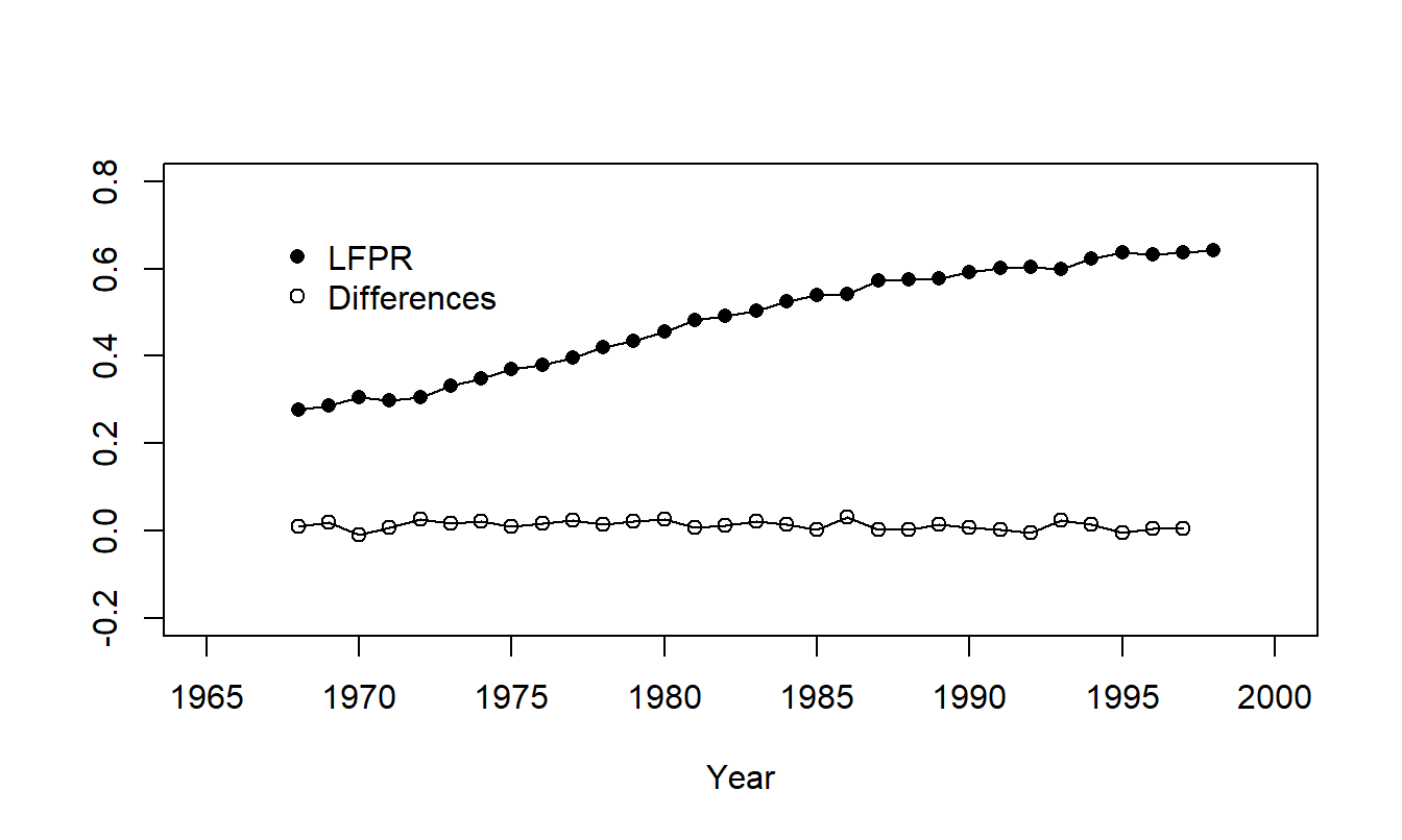
Figure 7.7: Labor Force Participation Rates for Females Aged 20-44, Living in a Household with a Spouse Present and at least One Child under Six Years of Age. The plot of the series shows a rapid increase over time. Also shown are the differences which are level.
R Code to Produce Figure 7.7
To forecast the \(LFPR\) with a random walk, we begin with our most recent observation, \(LFPR_{31}=0.6407\). We denote the change in the \(LFPR\) by \(c_t\), so that \(c_t=LFPR_t-LFPR_{t-1}\). It turns out that the average change is \(\overline{c}=0.0121\) with standard deviation \(s_c=0.0101\). Thus, using a random walk model, an approximate 95% prediction interval for the \(l\)-step forecast is \[ 0.6407+0.0121l\pm \ 0.0202\sqrt{l}. \] Figure 7.8 illustrates prediction intervals for 1999 through 2002, inclusive.
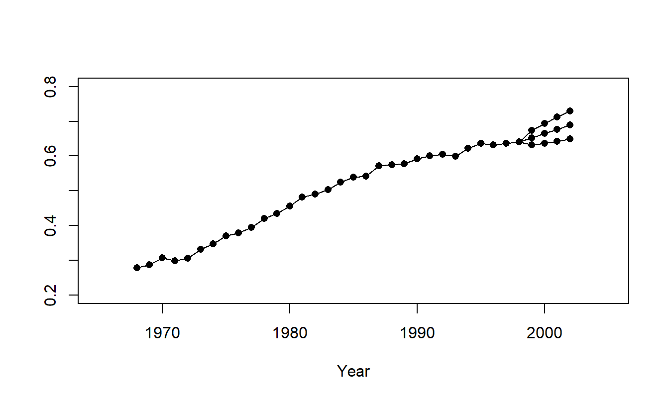
Figure 7.8: Time Series Plot of Labor Force Participation Rates with Forecast Values for 1999-2002. The middle series represent the point forecasts. The upper and lower series represent the upper and lower 95% forecast intervals. Data for 1968-1998 represent actual values.
R Code to Produce Figure 7.8
Identifying Stationarity
We have seen how to do useful things, like forecasting, with random walk models. But how do we identify a series as a realization from a random walk? We know that the random walk is a special kind of nonstationary model and so the first step is to examine a series and decide whether or not it is stationary.
Stationarity quantifies the stability of a process. A process that is strictly stationary has the same distribution over time, so we should be able to take successive samples of modest size and show that they have approximately the same distribution. For weak stationarity, the mean and variance are stable over time, so if one takes successive samples of modest size, then we expect the mean level and the variance to be roughly similar. To illustrate, when examining time series plots, if you look at the first five, the next five, the following five and so forth, successive samples, you should observe approximately the same levels of averages and standard deviations.
In quality management applications, this approach is quantified by looking at control charts. A control chart is a useful graphical device for detecting the lack of stationarity in a time series. The basic idea is to superimpose reference lines called control limits on a time series plot of the data. These reference lines help us visually detect trends in the data and identify unusual points. The mechanics behind controls limits are straightforward. For a given series of observations, calculate the series mean and standard deviation, \(\overline{y}\) and \(s_y\). Define the “upper control limit” by \(UCL=\overline{y} +3s_y\) and the “lower control limit” by \(LCL=\overline{y}-3s_y\). Time series plots with these superimposed control limits are known as control charts.
Sometimes the adjective retrospective is associated with this type of control chart. This adjective reminds the user that averages and standard deviations are based on all the available data. In contrast, when the control chart is used as an ongoing management tool for detecting whether an industrial process is “out of control,” a prospective control chart may be more suitable. Here, prospective merely means using only an early portion of the process, that is “in control,” to compute the control limits.
A control chart that helps us to examine the stability of the mean is the \(Xbar\) chart. An \(Xbar\) chart is created by combining successive observations of modest size, taking an average over this group, and then creating a control chart for the group averages. By taking averages over groups, the variability associated with each point on the chart is smaller than for a control chart for individual observations. This allows the data analyst to get a clearer picture of any patterns that may be evident in the mean of the series.
A control chart that helps us examine the stability of the variability is the \(R\) chart. As with the \(Xbar\) chart, we begin by forming successive groups of modest size. With the \(R\) chart, for each group we compute the range, which is the largest minus the smallest observation, and then create a control chart for the group ranges. The range is a measure of variability that is simple to compute, an important advantage in manufacturing applications.
Identifying Random Walks
Suppose that you suspect that a series is nonstationary, how do identify the fact that these are realizations of a random walk model? Recall that the expected value of a random walk, \(\mathrm{E~}y_t=y_0+t\mu_c\), suggests that such a series follows a linear trend in time. The variance of a random walk, \(\mathrm{Var~}y_t=t\sigma_c^2\), suggests that the variability of a series gets larger as time \(t\) gets large. First, a control chart can help us to detect these patterns, whether they are of a linear trend in time, increasing variability, or both.
Second, if the original data follows a random walk model, then the differenced series follows a white noise process model. If a random walk model is a candidate model, you should examine the differences of the series. In this case, the time series plot of the differences should be a stationary, white noise process that displays no apparent patterns. Control charts can help us to detect this lack of patterns.
Third, compare the standard deviations of the original series and the differenced series. We expect the standard deviation of the original series to be greater than the standard deviation of the differenced series. Thus, if the series can be represented by a random walk, we expect a substantial reduction in the standard deviation when taking differences.
Example: Labor Force Participation Rates - Continued. In Figure 7.7, the series displays a clear upward trend whereas the differences show no apparent trends over time. Further, when computing differences of each series, it turned out that \[ 0.1237=SD(series)>SD(differences)=0.0101. \] Thus, it seems reasonable to tentatively use a random walk as a model of the labor force participation rate series.
In Chapter 8, we will discuss two additional identification devices. These are scatter plots of the series versus a lagged version of the series and the corresponding summary statistics called autocorrelations.
Random Walk versus Linear Trend in Time Models
The labor force participation rate example could be represented using either a random walk or a linear trend in time model. These two models are more closely related to one another than is evident at first glance. To see this relationship, recall that the linear trend in time model can be written as \[\begin{equation} y_t = \beta_0 + \beta_1 t + \varepsilon_t, \tag{7.8} \end{equation}\] where \(\{\varepsilon_t\}\) is a white noise process. If \(\{y_t\}\) is a random walk, then it can be modeled as a partial sum as in equation (7.7). We can also decompose the white noise process into a mean \(\mu _c\) plus another white noise process, that is, \(c_t = \mu_c + \varepsilon_t\). Combining these two ideas, a random walk model can be written as
\[\begin{equation} y_t = y_0 + \mu_c t + u_t \tag{7.9} \end{equation}\] where \(u_t = \sum_{j=1}^{t} \varepsilon_j\). Comparing equations (7.8) and (7.9), we see that the two models are similar in that the deterministic portion is a linear function of time. The difference is in the error component. The error component for the linear trend in time model is a stationary, white noise process. The error component for the random walk model is nonstationary because it is the partial sum of white noise processes. That is, the error component is also a random walk. Many introductory treatments of the random walk model focus on the “fair game” example and ignore the drift term \(\mu_c\). This is unfortunate because the comparison between the random walk model and the linear trend in time model is not as clear when the parameter \(\mu_c\) is equal to zero.
Video: Section Summary
7.5 Filtering to Achieve Stationarity
A filter is a procedure for reducing observations to white noise. In regression, we accomplished this by simply subtracting the regression function from the observations, that is, \(y_i - (\beta_0 + \beta_1 x_{1i} + \ldots + \beta_k x_{ki})=\varepsilon_i\). Transformation of the data is another device for filtering that we introduced in Chapter 1 when analyzing cross-sectional data. We encountered another example of a filter in Section 7.3. There, by taking differences of observations, we reduced a random walk series to a white noise process.
An important theme of this text is to use an iterative approach for fitting models to data. In particular, in this chapter we discuss techniques for reducing a sequence of observations to a stationary series. By definition, a stationary series is stable and hence is far easier to forecast than an unstable series. This stage, sometimes known as pre-processing the data, generally accounts for the most important sources of trends in the data. The next chapter will present models that account for subtler trends in the data.
Transformations
When analyzing longitudinal data, transformation is an important tool used to filter a data set. Specifically, using a logarithmic transformation tends to shrink “spread out” data. This feature gives us an alternative method to deal with a process where the variability appears to grow with time. Recall the first option discussed is to posit a random walk model and examine differences of the data. Alternatively, one may take a logarithmic transform that helps to reduce increasing variance through time.
Further, from the random walk discussion, we know that if both the series variance and log series variance increase through time, the differences of the log transform might handle this increasing variability. Differences of natural logarithms are particularly pleasing because they can be interpreted as proportional changes. To see this, define \(pchange_t=(y_t/y_{t-1})-1\). Then, \[ \ln y_t-\ln y_{t-1} = \ln \left( \frac{y_t}{y_{t-1}}\right) = \ln \left( 1+pchange_t\right) \approx pchange_t. \] Here we use the Taylor series approximation \(\ln (1+x) \approx x\) that is appropriate for small values of \(|x|\).
Example: Standard and Poor’s Composite Quarterly Index. An important task of a financial analyst is to quantify costs associated with future cash flows. We consider here funds invested in a standard measure of overall market performance, the Standard and Poor’s (S&P) 500 Composite Index. The goal is to forecast the performance of the portfolio for discounting of cash flows.
In particular, we examine the S&P Composite Quarterly Index for the years 1936 to 2007, inclusive. By today’s standards, this period may not be the most representative because the Depression of the 1930’s is included. The motivation to analyze these data is from the Institute of Actuaries “Report of the Maturity Guarantees Working Party” (1980) who analyzed the series from 1936 to 1977, inclusive. This paper studied the long term behavior of investment returns from an actuarial viewpoint. We complement that work by showing how graphical techniques can suggest a useful transformation for reducing the data to a stationary process.
The data are shown in Figure 7.9. From the original index values in the upper left-hand panel, we see that the mean level and variability increases with time. This pattern clearly indicates that the series is nonstationary.
From our discussions in Sections 7.2 and 7.3, a candidate model that has these properties is the random walk. However, the time series plot of the differences, in upper right-hand panel of Figure 7.9, still indicates a pattern of variability increasing with time. The differences are not a white noise process so the random walk is not a suitable model for the S & P 500 Index.
An alternative transformation is to consider logarithmic values of the series. The time series plot of logged values, presented in lower left-hand panel of Figure 7.9, indicates the the mean level of the series increases over time and is not level. Thus, the logarithmic index is not stationary.
Yet another approach is to examine differences of the logarithmic series. This is especially desirable when looking at indices, or “breadbaskets,” because the difference of logarithms can be interpreted as proportional changes. From the final time series plot, in the lower right-hand panel of Figure 7.9, we see that there are fewer discernible patterns in the transformed series, the difference of logs. This transformed series seems to be stationary. It is interesting to note that there seems to be a higher level of volatility at the beginning of the series. This type of changing volatility is more difficult to model and has recently been the subject of considerable attention in the financial economics literature (see, for example, Hardy, 2003).
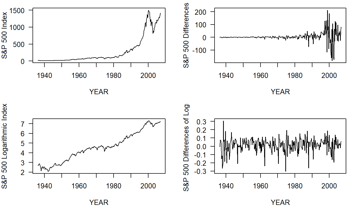
Figure 7.9: Time Series Plots of the S & P 500 Index.z The upper left-hand panel shows the original series that is nonstationary in the mean and in the variability. The upper right-hand panel shows the differences in the series that is nonstationary in the variability. The lower left-hand panel shows the logarithmic index that is nonstationary in the mean. The lower right hand panel shows the differences of the logarithmic index that appears to be stationary in the mean and in the variability.
R Code to Produce Figure 7.9
Video: Section Summary
7.6 Forecast Evaluation
Judging the accuracy of forecasts is important when modeling time series data. In this section, we present forecast evaluation techniques that:
- Help detect recent unanticipated trends or patterns in the data.
- Are useful for comparing different forecasting methods.
- Provide an intuitive and easy to explain method for evaluating the accuracy of forecasts.
In the first five sections of Chapter 7, we presented several techniques for detecting patterns in residuals from a fitted model. Measures that summarize the distribution of residuals are called goodness-of-fit statistics. As we saw in our study of cross-sectional models, by fitting several different models to a data set, we introduce the possibility of overfitting the data. To address this concern, we will use out-of-sample validation techniques, similar to those introduced in Section 6.5.
To perform an out-of-sample validation of a proposed model, ideally one would develop the model on a data set and then corroborate the model’s usefulness on a second, independent data set. Because two such ideal data sets are rarely available, in practice we can split a data set into two subsamples, a model development subsample and a validation subsample. For longitudinal data, the practice is to use the beginning part of the series, the first \(T_1\) observations, to develop one or more candidate models. The latter part of the series, the last \(T_2=T-T_1\) observations, are used to evaluate the forecasts. For example, we might have ten years of monthly data so that \(T=120\). It would be reasonable to use the first eight years of data to develop a model and the last two years of data for validation, yielding \(T_1=96\) and \(T_2=24\).
Thus, observations \(y_1,\ldots , y_{T_1}\) are used to develop a model. From these \(T_1\) observations, we can determine the parameters of the candidate model. Using the fitted model, we can determine fitted values for the model validation subsample for \(t = T_1 + 1,T_1+2, \ldots, T_1+T_2\). Taking the difference between the actual and fitted values yield one-step forecast residuals, denoted by \(e_t=y_t-\widehat{y}_t\). These forecast residuals are the basic quantities that we will use to evaluate and compare forecasting techniques.
To compare models, we use a four-step process similar to that described in Section 6.5, described as follows.
Out-of-Sample Validation Process
- Divide the sample of size \(T\) into two subsamples, a model development subsample (\(t=1,\ldots,T_1\)) and a model validation subsample (\(t=T_1+1, \ldots, T_1 + T_2\)).
- Using the model development subsample, fit a candidate model to the data set \(t=1,\ldots,T_1\).
- Using the model created in Step 2 and the dependent variables up to and including \(t-1\), forecast the dependent variable \(\widehat{y}_t\), where \(t=T_1+1, \ldots, T_1+T_2\).
- Use actual observations and the fitted values computed in Step 3 to compute one-step forecast residuals, \(e_t = y_t- \widehat{y}_t\), for the model validation subsample. Summarize these residuals with one or more comparison statistics, described below.
Repeat Steps 2 through 4 for each of the candidate models. Choose the model with the smallest set of comparison statistics.
Out-of-sample validation can be used to compare the accuracy of forecasts from virtually any forecasting model. As we saw in Section 6.5, we are not limited to comparisons where one model is a subset of another, where the competing models use the same units for the response, and so on.
There are several statistics that are commonly used to compare forecasts.
Commonly Used Statistics for Comparing Forecasts
The mean error statistic, defined by \[ ME=\frac{1}{T_2}\sum_{t=T_1+1}^{T_1+T_2}e_t. \] This statistic measures recent trends that are not anticipated by the model.
The mean percent error, defined by \[ MPE=\frac{100}{T_2}\sum_{t=T_1+1}^{T_1+T_2}\frac{e_t}{y_t}. \] This statistic is also a measure of trend, but examines error relative to the actual value.
The mean square error, defined by \[ MSE=\frac{1}{T_2}\sum_{t=T_1+1}^{T_1+T_2}e_t^2. \] This statistic can detect more patterns than \(ME\). It is the same as the cross-sectional \(SSPE\) statistic, except for the division by \(T_2\).
The mean absolute error, defined by \[ MAE=\frac{1}{T_2}\sum_{t=T_1+1}^{T_1+T_2}|e_t|. \] Like \(MSE\), this statistic can detect more trend patterns than \(ME\). The units of \(MAE\) are the same as the dependent variable.
The mean absolute percent error, defined by \[ MAPE=\frac{100}{T_2}\sum_{t=T_1+1}^{T_1+T_2}|\frac{e_t}{y_t}|. \] Like \(MAE\), this statistic can detect more than trend patterns. Like \(MPE\), it examines error relative to the actual value.
Example: Labor Force Participation Rates - Continued. We can use out-of-sample validation measures to compare two models for the \(LFPR\)s; the linear trend in time model and the random walk model. For this illustration, we examined the labor rates for years 1968 through 1994, inclusive. This corresponds to \(T_1 = 27\) observations defined in Step 1. Data were subsequently gathered on rates for 1995 through 1998, inclusive, corresponding to \(T_2 = 4\) for out-of-sample validation. For Step 2, we fit each model using \(t=1,\ldots,27\), earlier in this chapter. For Step 3, the one-step forecasts are:
\[ \widehat{y}_t = 0.2574 + 0.0145t \] and \[ \widehat{y}_t = y_{t-1} + 0.0132 \] for the linear trend in time and the random walk models, respectively. For Step 4, Table 7.2 summarizes the forecast comparison statistics. Based on these statistics, the choice of the model is clearly the random walk.
Table 7.2. Out of Sample Forecast Comparison
\[ \small{ \begin{array}{l|ccccc} \hline & ME & MPE & MSE & MAE & MAPE \\ \hline \text{Linear trend in time model} & -0.049 & -7.657 & 0.003 & 0.049 & 7.657 \\ \text{Random walk model} & -0.019& -2.946 & 0.001 & 0.019 & 3.049 \\ \hline \end{array} } \]
R Code to Produce Table 7.2
Video: Section Summary
7.7 Further Reading and References
For many years, actuaries in North America were introduced to time series analysis from Miller and Wichern (1977), Abraham and Ledolter (1983) and Pindyck and Rubinfeld (1991). A more recent book-long introduction is Diebold (2004). Diebold contains a brief introduction to regime-switching models.
Because of the difficulties regarding their specification and limited forecasting use, we do not explore causal models further in this text. For more details on causal models, the interested reader is referred to Pindyck and Rubinfeld (1991).
Chapter References
- “Report of the Maturity Guarantees Working Party” (1980). Journal of the Institute of Actuaries 107, pp. 103-213.
- Abraham, Bovas and Johannes Ledolter (1983). Statistical Methods for Forecasting. John Wiley & Sons, New York.
- Diebold, Francis X. (2004). Elements of Forecasting, Third Edition. Thompson South-Western, Mason, OH.
- Frees, Edward W. (2006). Forecasting of labor force participation rates. The Journal of Official Statistics 22(3), 453-485.
- Fullerton, Howard N., Jr. (1999). Labor force projections to 2008: steady growth and changing composition. Monthly Labor Review, November, pp. 19-32.
- Granger, Clive W. J and P. Newbold (1974). Spurious regressions in econometrics. Journal of Econometrics 2, 111-120.
- Hardy, Mary (2001). A regime-switching model of long-term stock returns. North American Actuarial Journal 5(2), 41-53.
- Hardy, Mary (2003). Investment Guarantees: Modeling and Risk Management for Equity-Linked Life Insurance. John Wiley & Sons, New York.
- Miller, Robert B. and Dean W. Wichern (1977). Intermediate Business Statistics: Analysis of Variance, Regression and Time Series. Holt, Rinehart and Winston, New York.
- Pindyck, R.S. and D.L. Rubinfeld (1991). Econometric Models and Economic Forecasts, Third Edition, McGraw-Hill, New York.
7.8 Exercises
7.1. Consider a random walk \(\{y_t \}\) as the partial sum of a white noise process \(\{ c_t \}\) with mean \(\mathrm{E}~c_t= \mu_c\) and variance \(\mathrm{Var}~c_t = \sigma_c^2\). Use equation (7.7) to show
\(\mathrm{E}~y_t= y_0 + t \mu_c\), where \(y_0\) is the initial value and
\(\mathrm{Var}~y_t= t \sigma_c^2\).
7.2. Consider a random walk \(\{y_t \}\) as the partial sum of a white noise process \(\{ c_t \}\).
Show that the \(l\)-step forecast error is \(y_{T+l}-\widehat{y_{T+l}} = \sum_{j=1}^l (c_{T+j} - \bar{c} ).\)
Show that the approximate variance of the \(l\)-step forecast error is \(l \sigma_c^2.\)
7.3. Euro Exchange Rates. The exchange rate that we consider is the amount of Euros that one can purchase for one US dollar. We have \(T=699\) daily observations from the period April 1, 2005 through January 8, 2008. These data were obtained from the Federal Reserve (H10 report). Source: Federal Reserve Bank of New York. Note: The data are based on noon buying rates in New York from a sample of market participants and they represent rates set for cable transfers payable in the listed currencies. These are also the exchange rates required by the Securities and Exchange Commission for the integrated disclosure system for foreign private issuers.
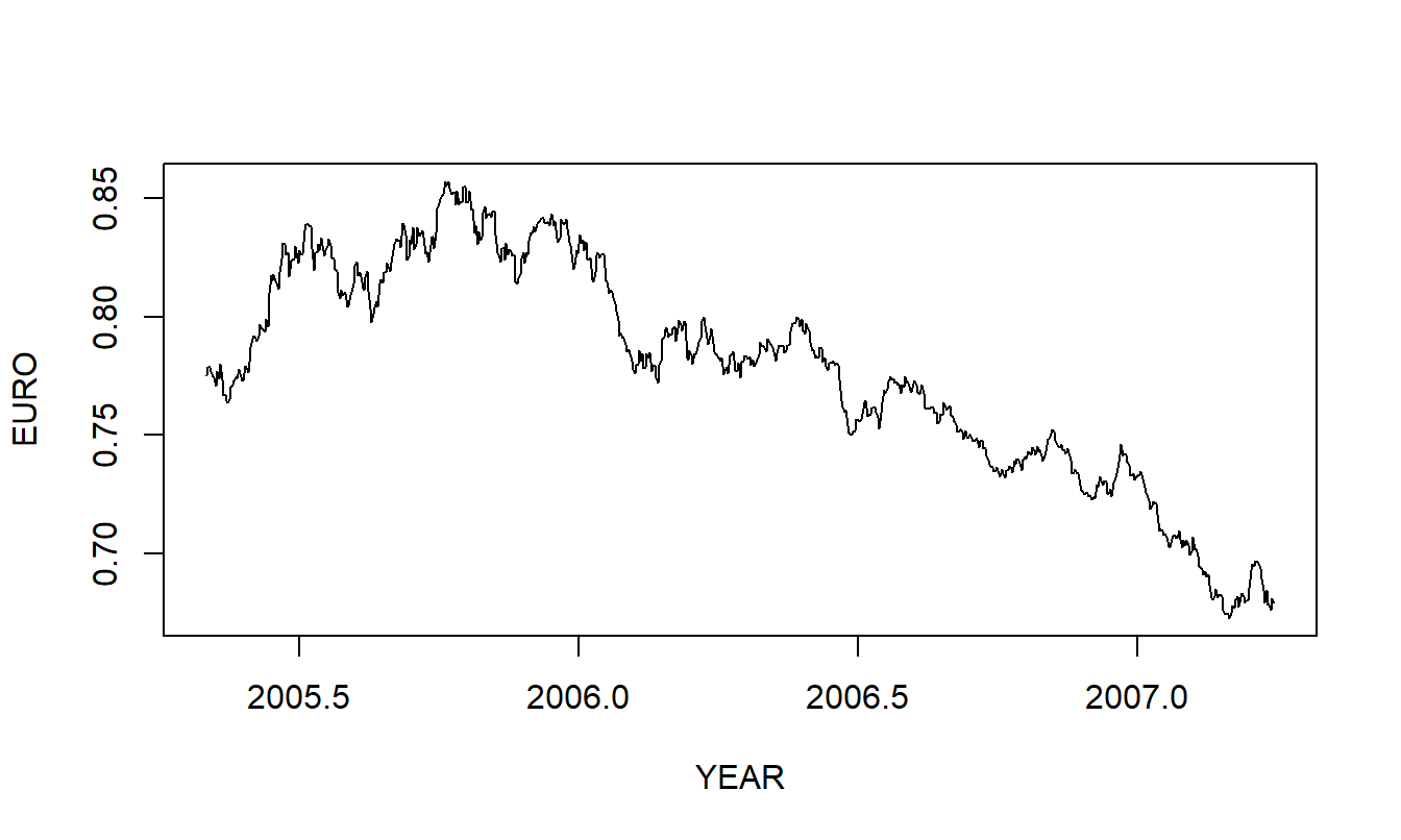
Figure 7.10: Time series plot of the Euro exchange rate.
- Figure 7.10 is a time series plot of the Euro exchange rate.
a(i). Define the concept of a stationary time series.
a(ii). Is the EURO series stationary? Use your definition in part a(i) to justify your response.
- Based on an inspection of Figure 7.10 in part (a), you decide to fit a quadratic trend model of the data. Figure 7.11 superimposes the fitted value on a plot of the series.
b(i). Cite several basic regression statistics that summarize the quality of the fit.
b(ii). Briefly describe any residual patterns that you observe in Figure 7.11.
b(iii). Here, TIME varies from \(1, 2, \ldots, 699\). Using this model calculate the three-step forecast corresponding to TIME = 702.
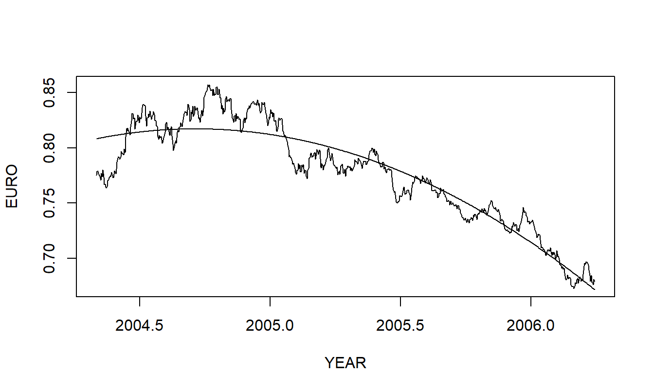
Figure 7.11: Quadratic fitted curve superimposed on the euro exchange rate.
- To investigate a different approach, DIFFEURO, calculate the difference of EURO. You decide to model DIFFEURO as a white noise process.
c(i). What is the name for the corresponding model of EURO?
c(ii). The most recent value of EURO is \(EURO_{699} = 0.6795\). Using the model identified in part c(i), provide a three-step forecast corresponding to TIME = 702.
c(iii). Using the model identified in part c(i) and the point forecast in part c(ii), provide the corresponding 95% prediction interval for \(EURO_{702}\).