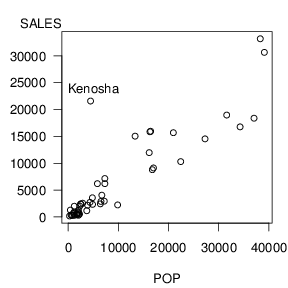
Figure 2.7 exhibits an outlier; the point in the upper left-hand side of the plot represents a zip code that includes Kenosha, Wisconsin. Sales for this zip code are unusually high given its population. Kenosha is close to the Illinois border; residents from Illinois probably participate in the Wisconsin lottery thus effectively increasing the potential pool of sales in Kenosha. Table 2.7 summarizes the regression fit both with and without this zip code.
begin{matrix}
begin{array}{c}
text{Table 2.7 Regression Results with and without Kenosha}
end{array}\small
begin{array}{l|rrrrr} hline text{Data} & b_0 & b_1 & s & R^2(%) & t(b_1) \ hline text{With Kenosha} & 469.7 & 0.647 & 3,792 & 78.5 & 13.26 \ text{Without Kenosha} & -43.5 & 0.662 & 2,728 & 88.3 & 18.82 \ hline end{array}
end{matrix}
[raw]
See R Code in Action
[/raw]
R Code and Output for Table 2.7
R Code for Figure 2.7
For the purposes of inference about the slope, the presence of Kenosha does not alter the results dramatically. Both slope estimates are qualitatively similar and the corresponding (t)-statistics are very high, well above cut-offs for statistical significance. However, there are dramatic differences when assessing the quality of the fit. The coefficient of determination, (R^2), increased from 78.5% to 88.3% when deleting Kenosha. Moreover, our "typical deviation" (s) dropped by over $1,000. This is particularly important if we wish to tighten our prediction intervals.
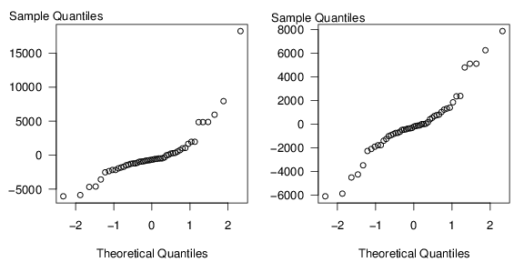
To check the accuracy of our assumptions, it is also customary to check the normality assumption. One way of doing this is the (qq) plot, introduced in Section 1.2. The two panels in Figures 2.8 are (qq) plots with and without the Kenosha zip code. Recall that points "close" to linear indicate approximate normality. In the right-hand panel of Figure 2.8, the sequence does appear to be linear so that residuals are approximately normally distributed. This is not the case in the left-hand panel, where the sequence of points appears to climb dramatically for large quantiles. The interesting thing is that the non-normality of the distribution is due to a single outlier, not a pattern of skewness that is common to all the observations.