import pandas as pdPython Examples for Soc 693
Introducing Objects
While R or Stata were designed specifically for data wrangling and statistical analysis, Python is a general-purpose programming language used for a wide variety of tasks. Python is an Object Oriented Language, meaning you’ll spend most of your time working with objects. (R is an object oriented language too, but in R you can kind of ignore that for a while. Not in Python.) In the programming world, an object is a collection of data and/or functions. Each object is an instance of a class, with the class defining what data and functions the instance will contain.
Objects can contain other objects. For example, a DataFrame object, which stores a classic data set with observations as rows and variables as columns, has one or more Series objects, each storing a column. If you extract a subset of a DataFrame that contains two columns, the result will be another DataFrame. However, if you extract a subset that contains one column, the result will be a Series.
Similar objects will often have the same functions. Both DataFrame and Series have sort_values() functions, for example. That means you can call the sort_values() function of an object without knowing or caring if the object is a DataFrame or Series. That’s a good thing, because sometimes when you extract a subset from a DataFrame (say, all the columns whose names match a certain pattern) you don’t know which one the result will be.
The Pandas package (short for Panel Data, but “cute” names are par for the course in Python) contains functions and class definitions related to working with data, including DataFrame and Series. So the first step is to import it, but since we’ll have to type its name a lot, we’ll give it the nickname pd:
Reading Data
You can read Stata data sets into Python with the read_stata() function. This is a Pandas function, so you need to refer to it as pd.read_stata() (i.e. package.function()). It can read from a file or directly from a URL, which we pass in as an argument to the function by putting it in the parentheses.
If you refer to an object without doing anything with it, JupyterLab will print it for you (“implicit print”). That lets us see some of the data and get a sense of what it looks like.
gss = pd.read_stata('https://www.ssc.wisc.edu/~hemken/soc693/dta/soc693_GSSex_step1v2.dta')
gss| year | age | agekdbrn | degree | sex | race | RES16 | FAMILY16 | RELIG16 | PASEI10 | cohort | wtssall | |
|---|---|---|---|---|---|---|---|---|---|---|---|---|
| 0 | 1972 | 23.0 | NaN | bachelor | female | white | BIG-CITY SUBURB | father | NaN | 62.0 | 1949.0 | 0.444600 |
| 1 | 1972 | 70.0 | NaN | LT HIGH SCHOOL | male | white | CITY GT 250000 | M AND F RELATIVES | NaN | 67.7 | 1902.0 | 0.889300 |
| 2 | 1972 | 48.0 | NaN | HIGH SCHOOL | female | white | CITY GT 250000 | MOTHER & FATHER | NaN | 31.6 | 1924.0 | 0.889300 |
| 3 | 1972 | 27.0 | NaN | bachelor | female | white | CITY GT 250000 | MOTHER & FATHER | NaN | 69.3 | 1945.0 | 0.889300 |
| 4 | 1972 | 61.0 | NaN | HIGH SCHOOL | female | white | TOWN LT 50000 | MOTHER & FATHER | NaN | 38.3 | 1911.0 | 0.889300 |
| ... | ... | ... | ... | ... | ... | ... | ... | ... | ... | ... | ... | ... |
| 64809 | 2018 | 37.0 | 29.0 | HIGH SCHOOL | female | white | TOWN LT 50000 | MOTHER & STPFATHER | catholic | 77.4 | 1981.0 | 0.471499 |
| 64810 | 2018 | 75.0 | 19.0 | HIGH SCHOOL | female | white | farm | MOTHER & FATHER | none | 14.0 | 1943.0 | 0.942997 |
| 64811 | 2018 | 67.0 | 22.0 | HIGH SCHOOL | female | white | COUNTRY,NONFARM | MOTHER & FATHER | protestant | 59.1 | 1951.0 | 0.942997 |
| 64812 | 2018 | 72.0 | 31.0 | HIGH SCHOOL | male | white | TOWN LT 50000 | MOTHER & FATHER | protestant | 68.6 | 1946.0 | 0.942997 |
| 64813 | 2018 | 79.0 | 21.0 | HIGH SCHOOL | female | white | farm | MOTHER & FATHER | catholic | 39.9 | 1939.0 | 0.471499 |
64814 rows × 12 columns
Note the column on the far left without a name. This is the index of the DataFrame. Every data set in every language should have one, but in Python it’s mandatory and it will make one for you if needed.
Problem: Categorical Variables
We can get a list of the variables in the data set and their data types by printing the dtypes attribute of the gss DataFrame:
gss.dtypesyear int16
age category
agekdbrn category
degree category
sex category
race category
RES16 category
FAMILY16 category
RELIG16 category
PASEI10 category
cohort category
wtssall category
dtype: objectYou can tell dtypes is an attribute and not a function (it doesn’t do anything) because there are no parentheses.
The result is not just a printout: it’s an actual Series object you could do things with. The first column, with the names of all the variables, is the index of the Series. Attributes can also contain functions though.
But why are most of the variables categories? Some of them should be, like sex, race, and RELIG16, but age and agekdbrn should be numbers. The problem is, pd.read_stata() assumes anything with value labels must be categorical. The GSS data applied value labels to the missing values of the numeric values, so now Python thinks they’re categorical. Fortunately that’s easy to fix, with one minor wrinkle we can see if we look at the values of age.
gss['age'] selects just the age column from gss. That’s one of several ways of subsetting a DataFrame. The value_counts() function gives you frequencies–and lists all the values. By default it will be sorted such that the most common category comes first. But if you pass in the key word argument sort=False it will leave them in their original order.
When we passed a URL to pd.read_stata() the argument was understood by its position as the first (and only) argument. For many functions the first one or two arguments are “obvious” (like the thing to read for pd.read_stata()). But using key word arguments makes it clear what each argument means.
gss['age'].value_counts(sort=False)18.0 241
19.0 861
20.0 885
21.0 1014
22.0 1082
...
85.0 197
86.0 186
87.0 148
88.0 121
89 OR OLDER 364
Name: age, Length: 72, dtype: int64Python isn’t going to be able to convert 89 OR OLDER to a number. We’ll replace it with just 89.0. The first step is to add it as an allowable category for the variable. The cat attribute of a categorical Series stores information and functions related to the categories, including the add_categories() function. Pass in ['89.0']. This is technically a one-item list–more on lists later.
Now we need to change all the rows where age is 89 OR OLDER to 89.0. To do this we will select the rows and column that need to be changed and set them to 89.0. This is done with the loc[] function, short for location, another method of subsetting. If you put two things in loc[]’s brackets, the first specifies rows and the second columns. Here we’ll specify the rows with a condition, gss['age']=='89 OR OLDER', meaning rows where that condition is true. This is just like saying if 'age'=='89 OR OLDER' in Stata. In Python you need to specify the DataFrame, gss, because it’s quite possible to write conditions based on a completely separate DataFrame or Series. Then select the age column. All the rows and columns selected will be set to '89.0'.
Check you work with value_counts().
gss['age'] = gss['age'].cat.add_categories(['89.0'])

gss.loc[gss['age']=='89 OR OLDER', 'age'] = '89.0'

gss['age'].value_counts(sort=False)
18.0 241
19.0 861
20.0 885
21.0 1014
22.0 1082
...
86.0 186
87.0 148
88.0 121
89 OR OLDER 0
89.0 364
Name: age, Length: 73, dtype: int64Now all the numeric variables are ready to be converted. You can do that with the pd.to_numeric() function, but it only works on one variable (Series) at a time. So we need to loop over the numeric variables. Fortunately, looping is easy in Python (especially compared to Stata–see Stata Programming Essentials).
A for loop executes some code once for each item in a list. A Python list is one or more items in square brackets (yes, Python uses square brackets for too many things) separated by columns. A placeholder variable (we’ll call it var) stores each item in turn. The loop starts with a colon (:). The code that is part of the loop is indented, and the loop ends when the indentation ends. In Python indentation doesn’t just make code easier to read–it’s essential to the syntax!
for var in ['age', 'agekdbrn', 'PASEI10', 'cohort', 'wtssall']:
    gss[var] = pd.to_numeric(gss[var])
gss.dtypes
year int16
age float64
agekdbrn float64
degree category
sex category
race category
RES16 category
FAMILY16 category
RELIG16 category
PASEI10 float64
cohort float64
wtssall float64
dtype: objectSummary Statistics
Now that the numeric variables are actually numbers, you can call the DataFrame describe() function to get summary statistics:
gss.describe()| year | age | agekdbrn | PASEI10 | cohort | wtssall | |
|---|---|---|---|---|---|---|
| count | 64814.000000 | 64586.000000 | 23658.000000 | 51104.000000 | 64586.000000 | 64814.000000 |
| mean | 1994.939180 | 46.099356 | 23.911024 | 44.105606 | 1948.846128 | 1.000015 |
| std | 13.465368 | 17.534703 | 5.560892 | 19.370755 | 21.262659 | 0.468172 |
| min | 1972.000000 | 18.000000 | 9.000000 | 9.000000 | 1883.000000 | 0.391825 |
| 25% | 1984.000000 | 31.000000 | 20.000000 | 28.700000 | 1934.000000 | 0.550100 |
| 50% | 1996.000000 | 44.000000 | 23.000000 | 39.900000 | 1951.000000 | 0.970900 |
| 75% | 2006.000000 | 59.000000 | 27.000000 | 57.500000 | 1964.000000 | 1.098500 |
| max | 2018.000000 | 89.000000 | 65.000000 | 93.700000 | 2000.000000 | 8.739876 |
It automatically skips categorical variables. For them you want frequencies, so loop over a list of all the categorical variables and run value_counts() on each. Implicit print will only print one thing per Jupyter cell, so have the loop do an explicit print with the print() function. Pass in a second argument, '\n' (new line) to put a blank line between each variable’s frequencies:
for var in ['degree', 'sex', 'race', 'RES16', 'FAMILY16', 'RELIG16']:
    print(gss[var].value_counts(dropna=False), '\n')
HIGH SCHOOL 33195
LT HIGH SCHOOL 13587
bachelor 9475
graduate 4716
JUNIOR COLLEGE 3668
NaN 173
Name: degree, dtype: int64
female 36200
male 28614
Name: sex, dtype: int64
white 52033
black 9187
other 3594
Name: race, dtype: int64
TOWN LT 50000 20076
CITY GT 250000 9851
50000 TO 250000 9805
farm 9440
BIG-CITY SUBURB 7078
COUNTRY,NONFARM 6935
NaN 1629
Name: RES16, dtype: int64
MOTHER & FATHER 44838
mother 8264
MOTHER & STPFATHER 3202
other 1606
NaN 1547
father 1533
M AND F RELATIVES 1434
FATHER & STPMOTHER 1199
FEMALE RELATIVE 980
MALE RELATIVE 211
Name: FAMILY16, dtype: int64
protestant 37042
catholic 17974
NaN 3438
none 3421
jewish 1266
other 648
christian 417
MOSLEM/ISLAM 161
ORTHODOX-CHRISTIAN 138
buddhism 128
hinduism 114
INTER-NONDENOMINATIONAL 31
NATIVE AMERICAN 24
OTHER EASTERN 12
Name: RELIG16, dtype: int64
Example: Frequencies and Proportions
Following Doug’s example R code, our next task is to make a table with the frequencies and proportions for agekdbrn. You can get proportions by passing normalize=True to value_counts():
gss['agekdbrn'].value_counts(normalize=True)21.0 0.090963
20.0 0.084792
19.0 0.077564
22.0 0.070758
18.0 0.066109
25.0 0.065263
23.0 0.064502
24.0 0.060656
26.0 0.050131
27.0 0.047426
17.0 0.043114
28.0 0.042058
30.0 0.038887
29.0 0.033477
16.0 0.026756
32.0 0.023037
31.0 0.021726
33.0 0.016443
35.0 0.013653
34.0 0.011962
15.0 0.009215
36.0 0.008412
37.0 0.006340
38.0 0.005241
39.0 0.004016
40.0 0.003762
14.0 0.003635
41.0 0.002071
42.0 0.001944
13.0 0.001522
43.0 0.000761
45.0 0.000634
44.0 0.000549
47.0 0.000507
46.0 0.000465
12.0 0.000338
50.0 0.000296
48.0 0.000169
49.0 0.000169
51.0 0.000169
52.0 0.000127
9.0 0.000085
65.0 0.000042
54.0 0.000042
11.0 0.000042
53.0 0.000042
56.0 0.000042
55.0 0.000042
57.0 0.000042
Name: agekdbrn, dtype: float64To combine the proportions with the frequencies, use pd.concat(). It takes a list of Series and puts them together in a DataFrame. We could create the Series ahead of time, but we can also just pass in the function calls that create them.
By default, pd.concat() will add the new Series as new rows. We want to add a new column, so pass in the key word argument axis=1. Python starts counting from 0, so rows are axis 0 and columns are axis 1.
The result is DataFrame, with the values of agekdbrn as an index. We can call functions of the DataFrame just like we call functions of gss. To put the table in order by age, add the sort_index() function. This is an example of function chaining: we’re calling a function of the result of a previous function. (This is what R does with its pipe.)
pd.concat([gss['agekdbrn'].value_counts(), gss['agekdbrn'].value_counts(normalize=True)], axis=1).sort_index()| agekdbrn | agekdbrn | |
|---|---|---|
| 9.0 | 2 | 0.000085 |
| 11.0 | 1 | 0.000042 |
| 12.0 | 8 | 0.000338 |
| 13.0 | 36 | 0.001522 |
| 14.0 | 86 | 0.003635 |
| 15.0 | 218 | 0.009215 |
| 16.0 | 633 | 0.026756 |
| 17.0 | 1020 | 0.043114 |
| 18.0 | 1564 | 0.066109 |
| 19.0 | 1835 | 0.077564 |
| 20.0 | 2006 | 0.084792 |
| 21.0 | 2152 | 0.090963 |
| 22.0 | 1674 | 0.070758 |
| 23.0 | 1526 | 0.064502 |
| 24.0 | 1435 | 0.060656 |
| 25.0 | 1544 | 0.065263 |
| 26.0 | 1186 | 0.050131 |
| 27.0 | 1122 | 0.047426 |
| 28.0 | 995 | 0.042058 |
| 29.0 | 792 | 0.033477 |
| 30.0 | 920 | 0.038887 |
| 31.0 | 514 | 0.021726 |
| 32.0 | 545 | 0.023037 |
| 33.0 | 389 | 0.016443 |
| 34.0 | 283 | 0.011962 |
| 35.0 | 323 | 0.013653 |
| 36.0 | 199 | 0.008412 |
| 37.0 | 150 | 0.006340 |
| 38.0 | 124 | 0.005241 |
| 39.0 | 95 | 0.004016 |
| 40.0 | 89 | 0.003762 |
| 41.0 | 49 | 0.002071 |
| 42.0 | 46 | 0.001944 |
| 43.0 | 18 | 0.000761 |
| 44.0 | 13 | 0.000549 |
| 45.0 | 15 | 0.000634 |
| 46.0 | 11 | 0.000465 |
| 47.0 | 12 | 0.000507 |
| 48.0 | 4 | 0.000169 |
| 49.0 | 4 | 0.000169 |
| 50.0 | 7 | 0.000296 |
| 51.0 | 4 | 0.000169 |
| 52.0 | 3 | 0.000127 |
| 53.0 | 1 | 0.000042 |
| 54.0 | 1 | 0.000042 |
| 55.0 | 1 | 0.000042 |
| 56.0 | 1 | 0.000042 |
| 57.0 | 1 | 0.000042 |
| 65.0 | 1 | 0.000042 |
Calculating a Summary Statistic
The mean() function calculates means. Similar functions are available for other summary statistics.
gss['agekdbrn'].mean()23.911023755177954Doug’s example does a t-test next, but in Python that requires a whole other library (SciPy) so we’ll skip it. Python’s not that great for statistics anyway.
Data Visualization
Doug cheated and used R’s quick-and-ugly plot() function rather than teaching you ggplot(). Python doesn’t have a quick-and-ugly way to make graphs, but it does have a port of ggplot called plotnine. So, ironically enough, I’m going to teach you how to use R’s standard graphics tool in a Python lecture.
ggplot() is based on the Grammar of Graphics (hence the name). In the Grammar of Graphics, and aesthetic defines the relationship between a variable and a feature of the graph, such as the x-coordinate or the color of the points. A geometry defines what the relationship will look like.
Histograms
First, import plotnine as p9. To create a plot, call the p9.ggplot() function, passing in the DataFrame to be plotted. Then add to it the result of a p9.aes() function that defines the aesthetic, then one of the p9.geom() functions with the desired geometry. To make a histogram of agekdbrn, make x='agekdbrn' the aesthetic and the geometry geom_histogram(). Pass in binwidth=1 to get one bin for each value.
import plotnine as p9

p9.ggplot(gss) + p9.aes(x='agekdbrn') + p9.geom_histogram(binwidth=1)
/home/r/rdimond/.local/lib/python3.9/site-packages/plotnine/layer.py:333: PlotnineWarning: stat_bin : Removed 41156 rows containing non-finite values.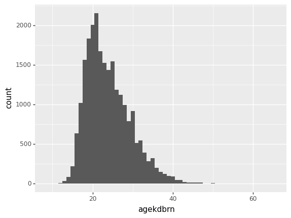
<ggplot: (8759070341973)>The warning just means it’s ignoring the missing values, which is good. Now compare that with age:
p9.ggplot(gss) + p9.aes(x='age') + p9.geom_histogram(binwidth=1)/home/r/rdimond/.local/lib/python3.9/site-packages/plotnine/layer.py:333: PlotnineWarning: stat_bin : Removed 228 rows containing non-finite values.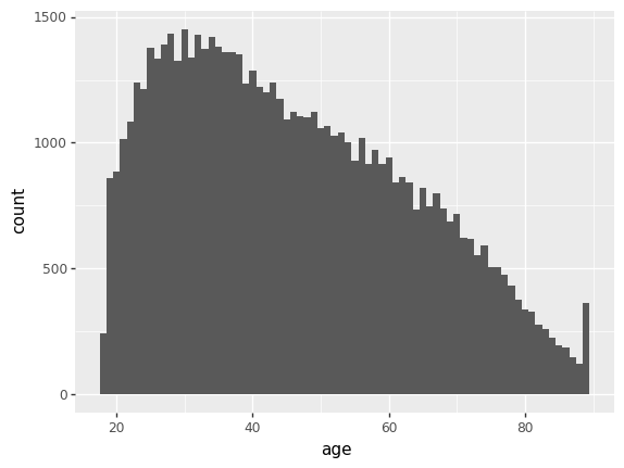
<ggplot: (8759060933759)>Scatterplots
To crate a scatterplot, set both an x and a y coordinate in the aesthetic and use p9.geom_point().
p9.ggplot(gss) + p9.aes(x='age', y='agekdbrn') + p9.geom_point()/home/r/rdimond/.local/lib/python3.9/site-packages/plotnine/layer.py:411: PlotnineWarning: geom_point : Removed 41209 rows containing missing values.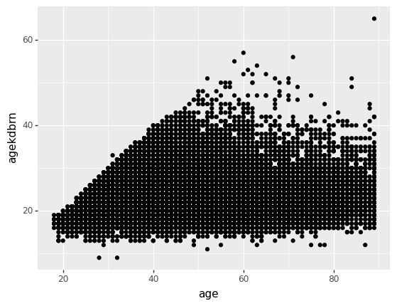
<ggplot: (8759060321470)>You could almost copy this code and paste it into R and have it run. The only difference is that in R you don’t have to specify which package a function comes from (which is great until two packages try to define the same function) so you’d need to remove p9. from all the function calls. By the same token, you can read our guide to Data Visualization in R with ggplot2, or take the class, and apply it in Python.
Recoding
Next we’ll recode degree and create ed3 with just three values. Start by taking a look at the values of degree:
gss['degree'].value_counts(sort=False)LT HIGH SCHOOL 13587
HIGH SCHOOL 33195
JUNIOR COLLEGE 3668
bachelor 9475
graduate 4716
Name: degree, dtype: int64The categories we want for ed3 are ‘Less Than High School’, ‘High School or Junior College’, and ‘Bachelor Degree or Higher’. To create ed3 you just use it in a subset as if it already existed, assign it a value, and it will be created automatically. If the subset does not contain all rows, the other rows will get missing (NaN).
Thus the recoding process works just like changing 89 OR OLDER to 89.0: select the proper rows and the new ed3 column using loc[] and set them to the appropriate value. Use the pipe character (|) for logical or, just like in Stata, but Python is really picky about having each part of the condition in parentheses.
gss.loc[gss['degree']=='LT HIGH SCHOOL', 'ed3'] = 'Less Than High School'
gss.loc[(gss['degree']=='HIGH SCHOOL') |  (gss['degree']=='JUNIOR COLLEGE'), 'ed3'] = 'High School or Junior College'
gss.loc[(gss['degree']=='bachelor') | (gss['degree']=='graduate'), 'ed3'] = 'Bachelor Degree or Higher'
gss| year | age | agekdbrn | degree | sex | race | RES16 | FAMILY16 | RELIG16 | PASEI10 | cohort | wtssall | ed3 | |
|---|---|---|---|---|---|---|---|---|---|---|---|---|---|
| 0 | 1972 | 23.0 | NaN | bachelor | female | white | BIG-CITY SUBURB | father | NaN | 62.0 | 1949.0 | 0.444600 | Bachelor Degree or Higher |
| 1 | 1972 | 70.0 | NaN | LT HIGH SCHOOL | male | white | CITY GT 250000 | M AND F RELATIVES | NaN | 67.7 | 1902.0 | 0.889300 | Less Than High School |
| 2 | 1972 | 48.0 | NaN | HIGH SCHOOL | female | white | CITY GT 250000 | MOTHER & FATHER | NaN | 31.6 | 1924.0 | 0.889300 | High School or Junior College |
| 3 | 1972 | 27.0 | NaN | bachelor | female | white | CITY GT 250000 | MOTHER & FATHER | NaN | 69.3 | 1945.0 | 0.889300 | Bachelor Degree or Higher |
| 4 | 1972 | 61.0 | NaN | HIGH SCHOOL | female | white | TOWN LT 50000 | MOTHER & FATHER | NaN | 38.3 | 1911.0 | 0.889300 | High School or Junior College |
| ... | ... | ... | ... | ... | ... | ... | ... | ... | ... | ... | ... | ... | ... |
| 64809 | 2018 | 37.0 | 29.0 | HIGH SCHOOL | female | white | TOWN LT 50000 | MOTHER & STPFATHER | catholic | 77.4 | 1981.0 | 0.471499 | High School or Junior College |
| 64810 | 2018 | 75.0 | 19.0 | HIGH SCHOOL | female | white | farm | MOTHER & FATHER | none | 14.0 | 1943.0 | 0.942997 | High School or Junior College |
| 64811 | 2018 | 67.0 | 22.0 | HIGH SCHOOL | female | white | COUNTRY,NONFARM | MOTHER & FATHER | protestant | 59.1 | 1951.0 | 0.942997 | High School or Junior College |
| 64812 | 2018 | 72.0 | 31.0 | HIGH SCHOOL | male | white | TOWN LT 50000 | MOTHER & FATHER | protestant | 68.6 | 1946.0 | 0.942997 | High School or Junior College |
| 64813 | 2018 | 79.0 | 21.0 | HIGH SCHOOL | female | white | farm | MOTHER & FATHER | catholic | 39.9 | 1939.0 | 0.471499 | High School or Junior College |
64814 rows × 13 columns
Creating Categorical Variables
If you look at the dtypes of gss, you’ll see ed3 is an object. While that could mean just about anything, in practice if a variable shows up as object it’s almost always a string. We want it to be a categorical variable.
gss.dtypesyear int16
age float64
agekdbrn float64
degree category
sex category
race category
RES16 category
FAMILY16 category
RELIG16 category
PASEI10 float64
cohort float64
wtssall float64
ed3 object
dtype: objectLike in Stata, a Python categorical variable has a string description of the category and an underlying number. But in Python you never need to know or care what the number is. You just write code using the string descriptions, like we’ve done so far. To make a column a categorical variable, call its astype() function and pass in category. Python will assign numeric values for each string, without any further intervention by you.
Why not just leave them as string? Some tasks need them to be categories, but also storing one number per observation takes a lot less memory than one string per observation.
gss['ed3'] = gss['ed3'].astype('category')
gss.dtypes
year int16
age float64
agekdbrn float64
degree category
sex category
race category
RES16 category
FAMILY16 category
RELIG16 category
PASEI10 float64
cohort float64
wtssall float64
ed3 category
dtype: objected3 is really an ordered categorical variable, but Python doesn’t know that yet. To tell it, call the column’s cat.reorder_categories() function, passing in a list of the categories in order and the argument ordered=True.
gss['ed3'] = gss['ed3'].cat.reorder_categories(
    [
        'Less Than High School',
        'High School or Junior College',
        'Bachelor Degree or Higher'
    ],
    ordered=True
)
Once a categorical variable is ordered, you can use things like greater than, less than, max() and min() even though the values are all strings (as far as you’re concerned):
gss['ed3'].max()'Bachelor Degree or Higher'Boxplots
Now make a boxplot showing the distribution of agekdbrn by level of ed3. The aesthetic for this is that ed3 is the x-coordinate and agekdbrn the y-coordinate. The geometry is p9.geom_boxplot().
p9.ggplot(gss) + p9.aes(x='ed3', y='agekdbrn') + p9.geom_boxplot()/home/r/rdimond/.local/lib/python3.9/site-packages/plotnine/layer.py:333: PlotnineWarning: stat_boxplot : Removed 41156 rows containing non-finite values.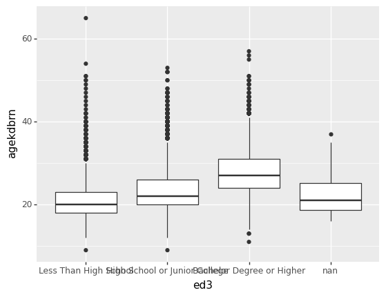
<ggplot: (8759060258036)>That’s ugly because the x-axis labels overlap. Fortunately there’s a simple solution: turn the graph sideways. You can’t do that by just swapping the x and y coordinate because p9.geom_boxplot() always plots the distribution of y across the levels of x. Instead, add p9.coord_flip() to the chain. This makes the logical x axis vertical and the logical y axis horizontal:
p9.ggplot(gss) + p9.aes(x='ed3', y='agekdbrn') + p9.geom_boxplot() + p9.coord_flip()/home/r/rdimond/.local/lib/python3.9/site-packages/plotnine/layer.py:333: PlotnineWarning: stat_boxplot : Removed 41156 rows containing non-finite values.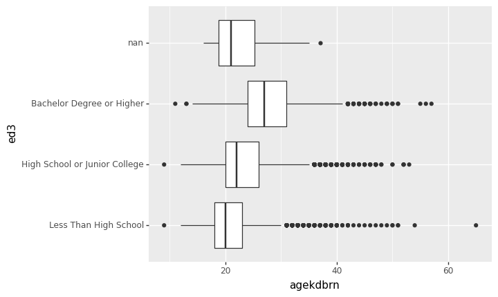
<ggplot: (8759060242270)>Much better! Most of the time bar graphs, boxplots, or anything else with categorical labels will work better if the categorical variable is vertical and the bars/boxes/whatever are horizontal.
It may be very important to your analysis to recognize that the people with NaN for ed3 are most like the people with less than a high school education when it comes to agekdbrn. It looks like the data are not missing completely at random and that could bias your analysis. But for a paper you probably don’t want to include that category in your graph. That’s okay: just pass a subset of gss to p9.ggplot().
You just can’t select that subset the way you’re used to in Stata. In Python, any condition involving NaN (missing) returns False. So if you wrote gss['ed3']==NaN the result would be False whether ed3 was missing or not. (Actually, that code wouldn’t work. We won’t go into how to write it in a valid way because it still wouldn’t give the result you need.) Instead, use the functions notna() or isna() to detect whether a value is missing or not. In this case we want notna().
p9.ggplot(gss[gss['ed3'].notna()]) + p9.aes(x='ed3', y='agekdbrn') + p9.geom_boxplot() + p9.coord_flip()/home/r/rdimond/.local/lib/python3.9/site-packages/plotnine/layer.py:333: PlotnineWarning: stat_boxplot : Removed 41015 rows containing non-finite values.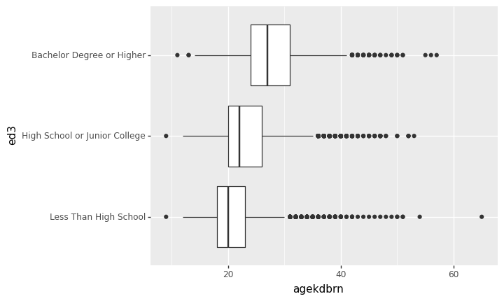
<ggplot: (8759058393338)>